
Fjori Fôra rebranding
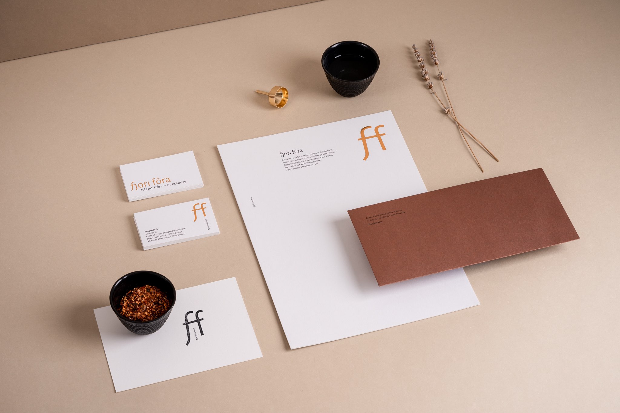
verbal communication / visual identity / promotional materials
Fjori Fôra is a result of a demanding and full-scale rebranding project in which we set out a new brand strategy and brand architecture for the complex group of Ćurin products. A new name, verbal communication, visual identity of the group, and the identity and design of the packaging of individual product lines within the group were created.
The Ćurin family makes natural products, primarily cosmetics, based on a line of essential oils from wild and grown plants. Due to the configuration of the terrain, mechanization is used very little, so the plantations are still cultivated and harvested in the traditional way. The picking of wild plants on the entire island of Hvar adds a special value to it.
As the main reason for rebranding is the placement in the external market, with a particular focus on the north-west of the EU, communicating the highest-quality natural products and their positioning in the premium segment was the primary goal. Given the different markets and specific product lines, the geographical origin is communicated at a secondary level. The aim was to increase the brand’s visibility and recognition in the Croatian, regional and global markets and to create a long-term image of a brand based on natural and original values that markets contemporary products of superior quality produced by a sustainable and socially responsible family farm.
The solution uses evocative, poetic elements conveying the originality and distinctiveness of the island product. The new name gives the opportunity to create solutions that suggest high quality and helping it access the demanding global market; it will be the primary focus of this brand in the coming period.
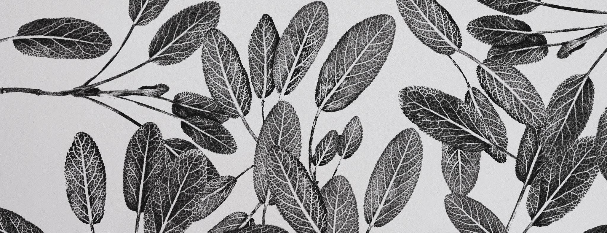
The basic idea of the identity and all creative communication is based on preserving the plants and presenting plant motifs by using the traditional methods and techniques such as herbariums, plant impressions in clay, imprints on paper or canvas, encyclopedic study drawings etc.
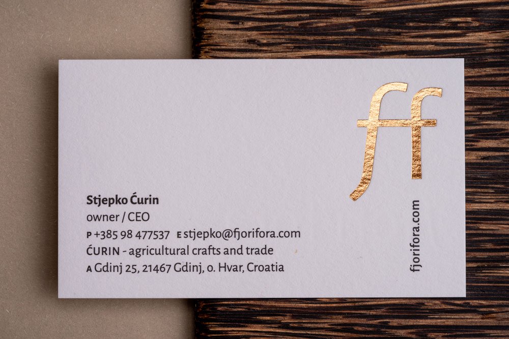
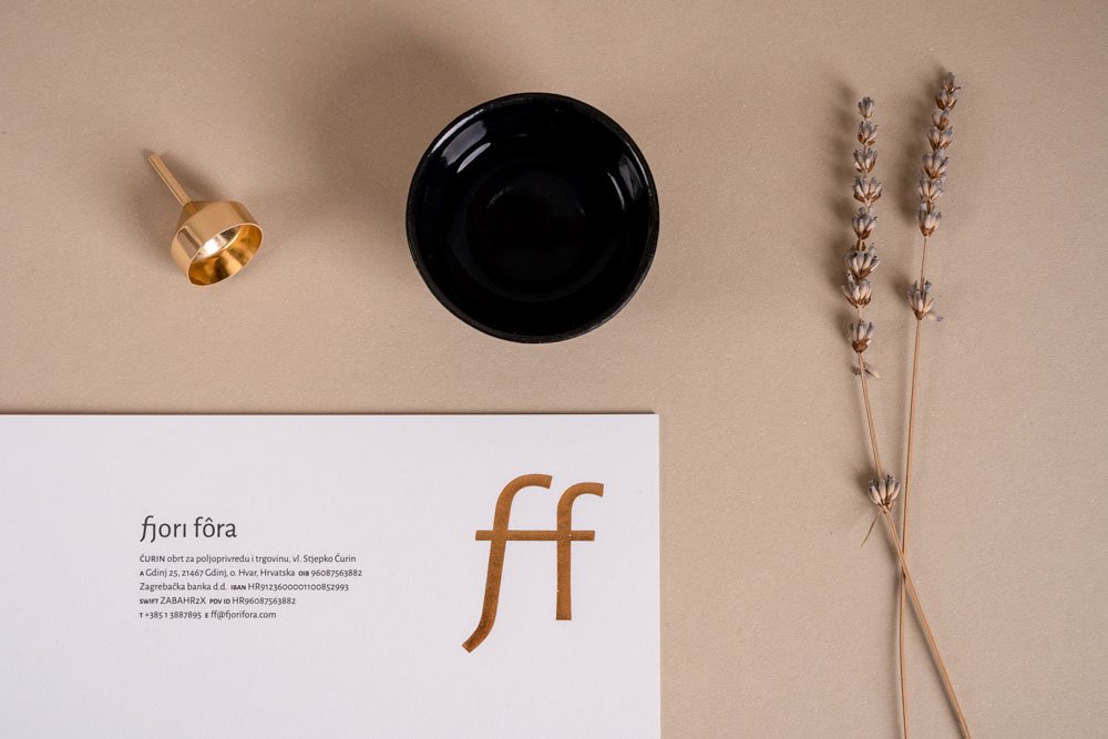
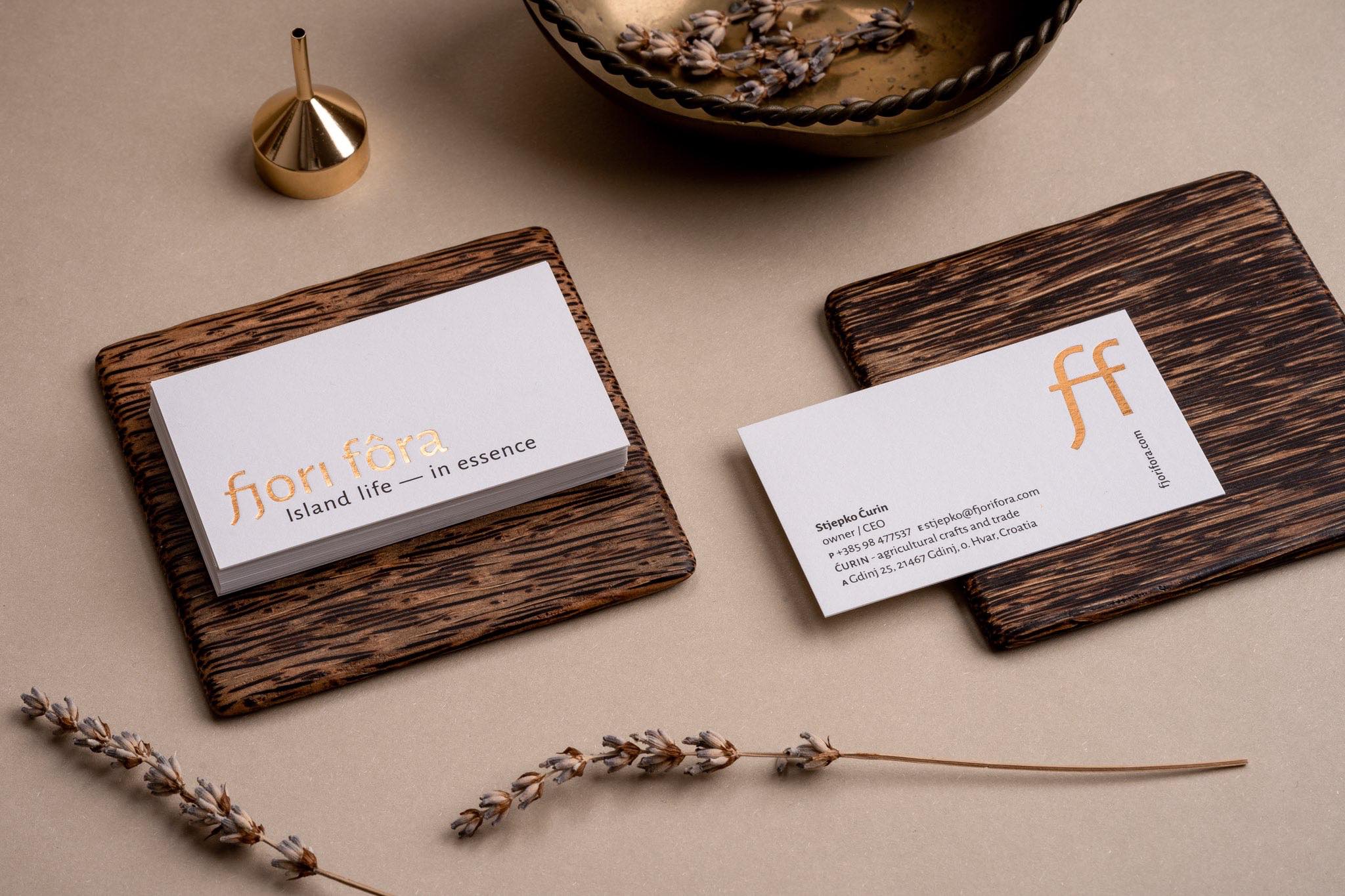
The almost monochromatic approach further emphasizes the importance of the plant and its originality, and the use of the hot foil stamped elements in dark gold-copper color communicates the high value of the product. Depending on the product line in the Fjora fôra group, the base color can be perceived as “liquid gold” – like with essential oils – or as a great value of the soil that gives life to all the precious plants on this rock-bound island.
Identity communicates both strength and the tenderness of the natural approach and natural products, while subtly combining the necessary elegance and exclusivity on the one hand and the natural sources from which the products originate on the other.
Client
- ĆURIN - agricultural crafts and trade
Creative team
- Izvorka Juric (creative and art direction), Igor Poturic (verbal communication), Izvorka Juric (design), Jurica Kos, Marijo Franic (illustration), Natalija Najjar (production manager), Jurica Kos (photography)
The name Fjori fôra, literally meaning “the flowers if Hvar”, is an evocation of the experience that this island offers – the melody of local speech and the visual and aromatic sensations of the Mediterranean climate. Fjori – flowers in the local Hvar dialect, can be understood ambiguously, as a metaphor for the whole plant, but also its most beautiful part, suggesting top quality and beauty. Fôra – one of the variants of the local names of the island of Hvar (Fôr), with a distinctive Hvar accent that underlines the brand’s vocal and graphic identity.
The slogan rounds out the basic impression and atmosphere. What else Fjori Fora products are if not the life in the Mediterranean island in its core or essence? At the same time, they tell us about the plant essence as the basic ingredient of most products.


Identity and communication are based on a combination of the local (tradition, naturalness, geo-location) and contemporary (top quality, certification, security, recipes), which primarily needs to be communicated through branding and the packaging design of a product line.
As there are many products that require various applications of identity, a monogram was created in order to highlight the brand and ensure distinctiveness in different contexts.

The Ćurin family has been cultivating lavender in Gdinj on the island of Hvar since 1955. This family eco-project is run by the heirs of the "head" of the family, who is over 90 years old but still tills the land.

All illustrations of this identity came from the direct transfer of the plant from proven sources - from the Ćurin family farm from the island of Hvar, just as all Fjori Fôra products.


As plants are the core value and a starting point of all Fjori Fôra products, they also constitute the basis of the identity and overall creative communication of this rebranding.
This why all the plants in the illustrations of the new identity were preserved and depicted by using the traditional methods and techniques such as herbariums, plant impressions in clay or imprints on paper or canvas, encyclopedic study drawings…

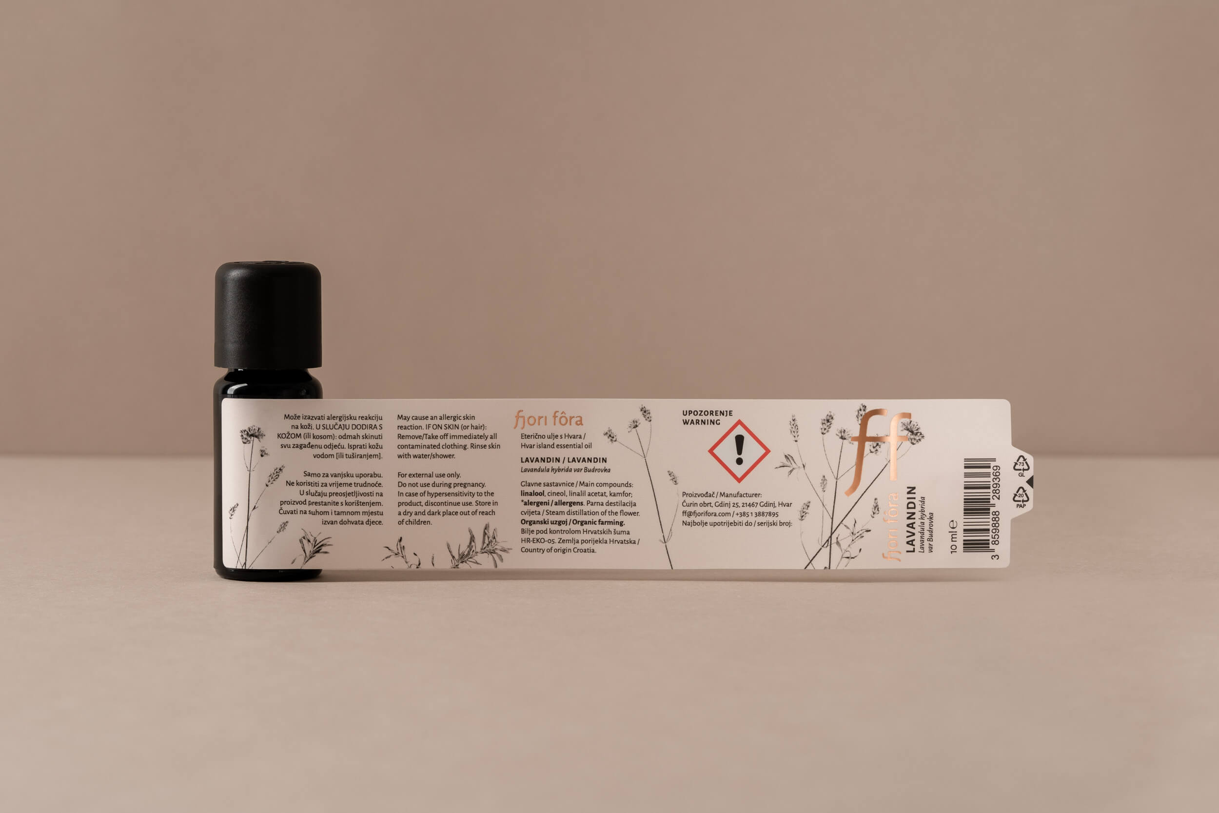
The basic line of Fjori Fôra products is a line of essential oils from wild and grown plants. The products are available as individual packaging and in a gift set with a diffuser.


Some Fjori fôra product lines have a separate communication, including a slogan, because they address a specific target group or operate in specific market categories. The line of bio spices communicates with the slogan “Good herbs from good hands”, which highlights the concept of human touch, the fact that the plants are harvested and processed by hand, that it is not a matter of mass but family production, which is still carried out in a traditional way today.
More about the Fjori fôra line of bio spices.


In the creation of individual lines, emphasis is also placed on product design and the use of traditional or modern sustainable packaging materials, which we will present soon. Follow us!
Awards and honors
_
published in book Pregled hrvatskog dizajna 21/22
Croatian Designers Society, 2022, CRO
_
part of “Exhibition of Croatian Design 21/22”
Croatian Designers Society, 2022, CRO
_
finalist at Fedrigoni TOP Award
2022, International