
NUTRIS identity system
verbal communication / visual identity / promotional materials
NUTRIS group operates in the field of agricultural production with three companies – Nutris.farm, which provides agricultural logistics and distribution services, Nutris.tech, which produces and sells raw materials that are primarily used in food production, and Nutris.me, which markets healthy food brands and various organic and sustainable products. Companies operate in the b2b segment and communicate to large manufacturers, so the communication needs to find a balance between temptingly expressive and the necessary corporate seriousness.
The goal of this identity system is to raise the overall impression to a much higher level than is now present in similar companies on the market, and thus highlight NUTRIS as a high quality and competitive group in Europe.
Identity is designed as a system that opens up the possibility of expansion of the group. In such a system, Nutris is the primary information and extensions (tech, farm, me, etc.) is the secondary information in the name of the company. The potential of the system is also visible through the mutation of the logo. By graphical development of the form of the initial letter of the group name, a logo communicates the activity of the company.
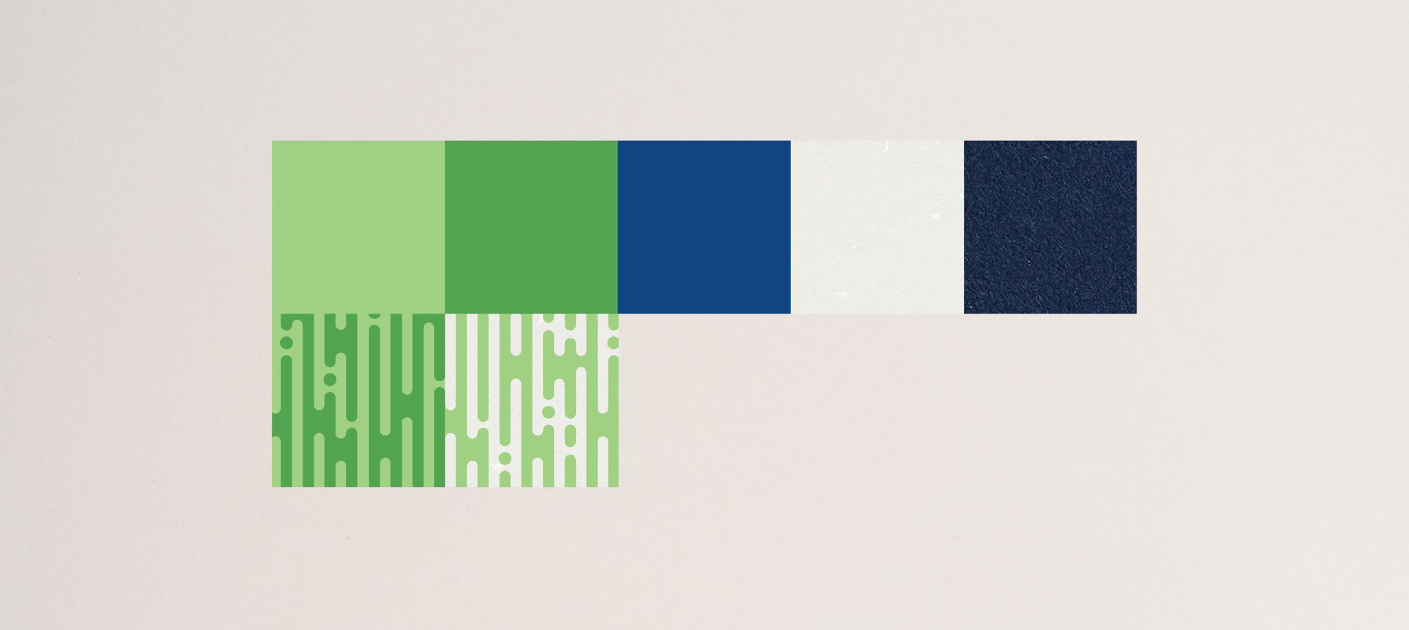
Guidelines for further identity development are visible through a range of home colors, a selection of white and blue recycled papers, and additional graphic identity elements, such as patterns, for use in the design of corporate and promotional materials.
Client
- NutriS d.o.o.
Creative team
- Izvorka Juric (creative and art direction), Igor Poturic (verbal communication), Izvorka Juric, Marko Mikicic (design), Natalija Najjar (production manager), Jurica Kos (photography)


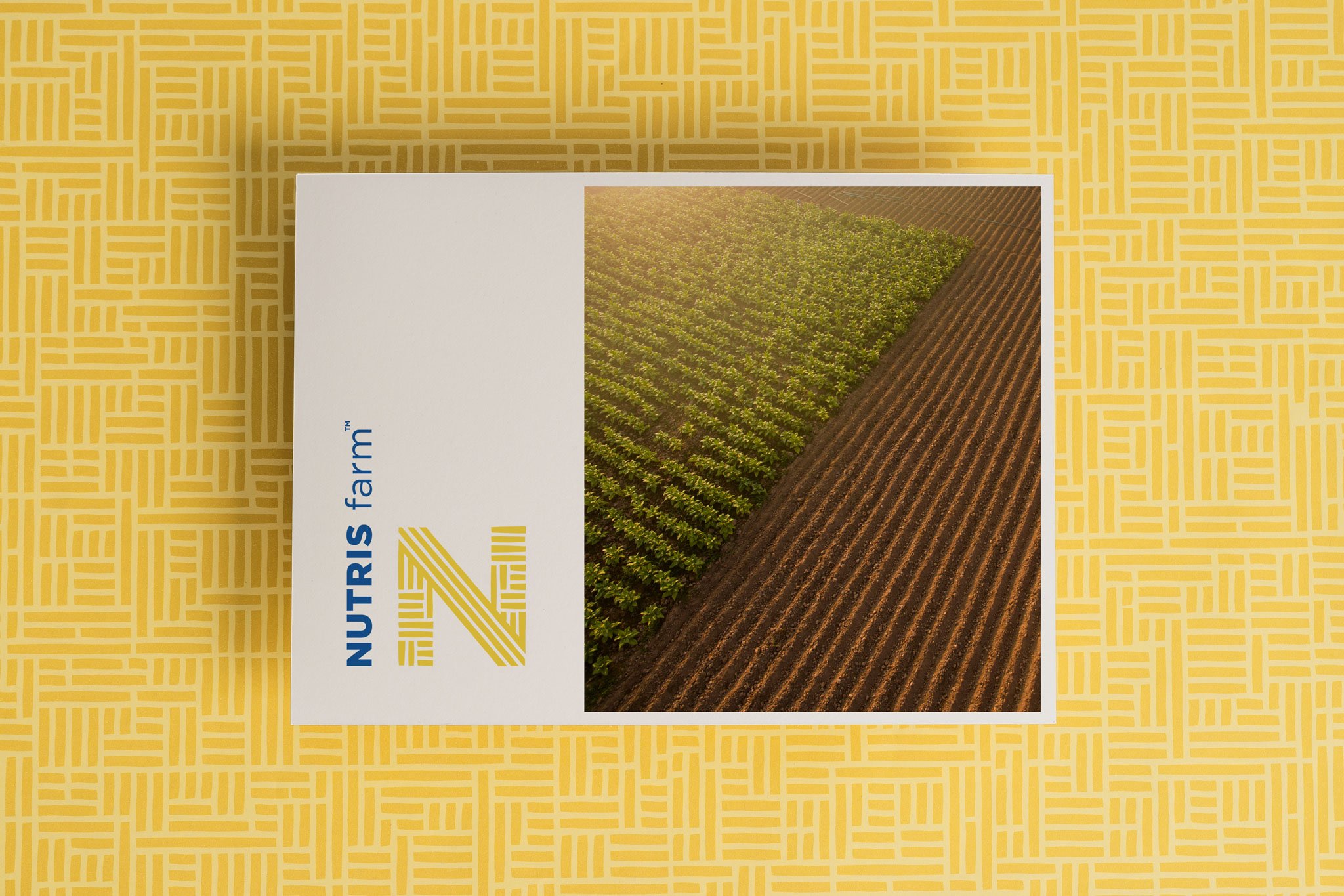
Nutris.farm provides agricultural logistics and distribution services. Intersecting linear forms are the building blocks of the letter N, because such structures are associated with agricultural fields and logistics.


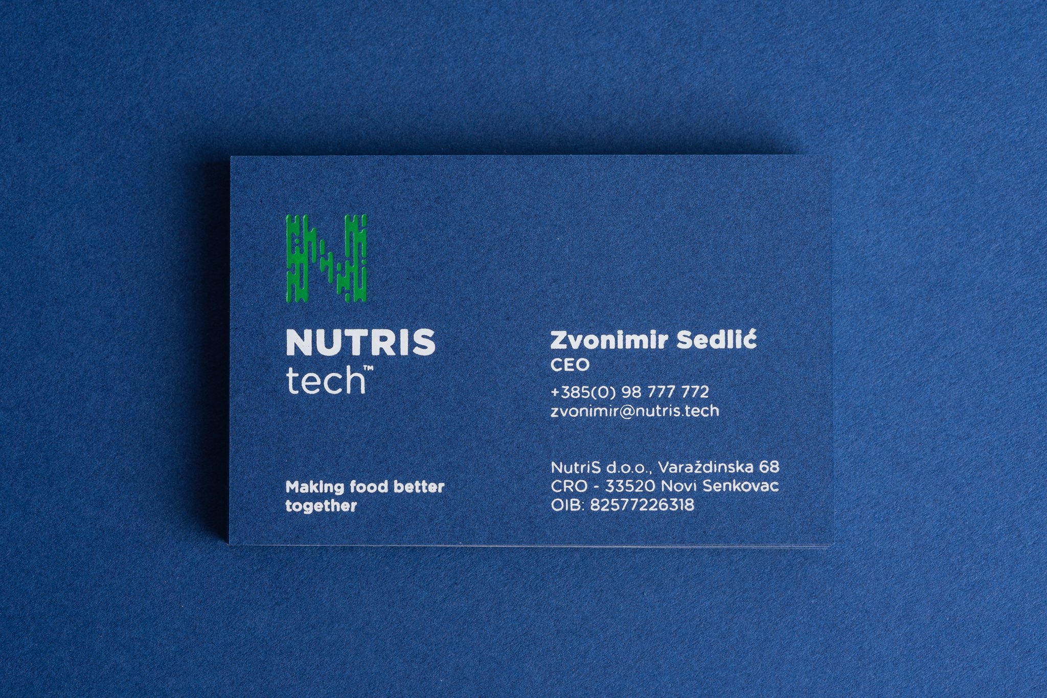
Nutris.tech operates in the field of secondary agricultural production, and produces and sells raw materials that are primarily used in food production. The basic products are 90% proteins from beans and native starch from potatoes, which are one of the basic ingredients in the production of a number of processed foods. Circular forms that connect are the building fabric of the letter N, because such structures are associated with the joining and construction of elements.


Nutris.me markets brands from the field of healthy food and various organic and sustainable products, such as hemp products, alternatives to meat of animal origin, etc. The brands communicate in the B2C segment, so the pattern is more dynamic, and the form is associated with fibers or intertwined compounds from nature.


Awards and honors
_
published in book Pregled hrvatskog dizajna 21/22
Croatian Designers Society, 2022, CRO
_
part of “Exhibition of Croatian Design 21/22”
Croatian Designers Society, 2022, CRO
_
Worldwide Logo Design Award – WOLDA Gold Award, New Logo Europe
2020, International