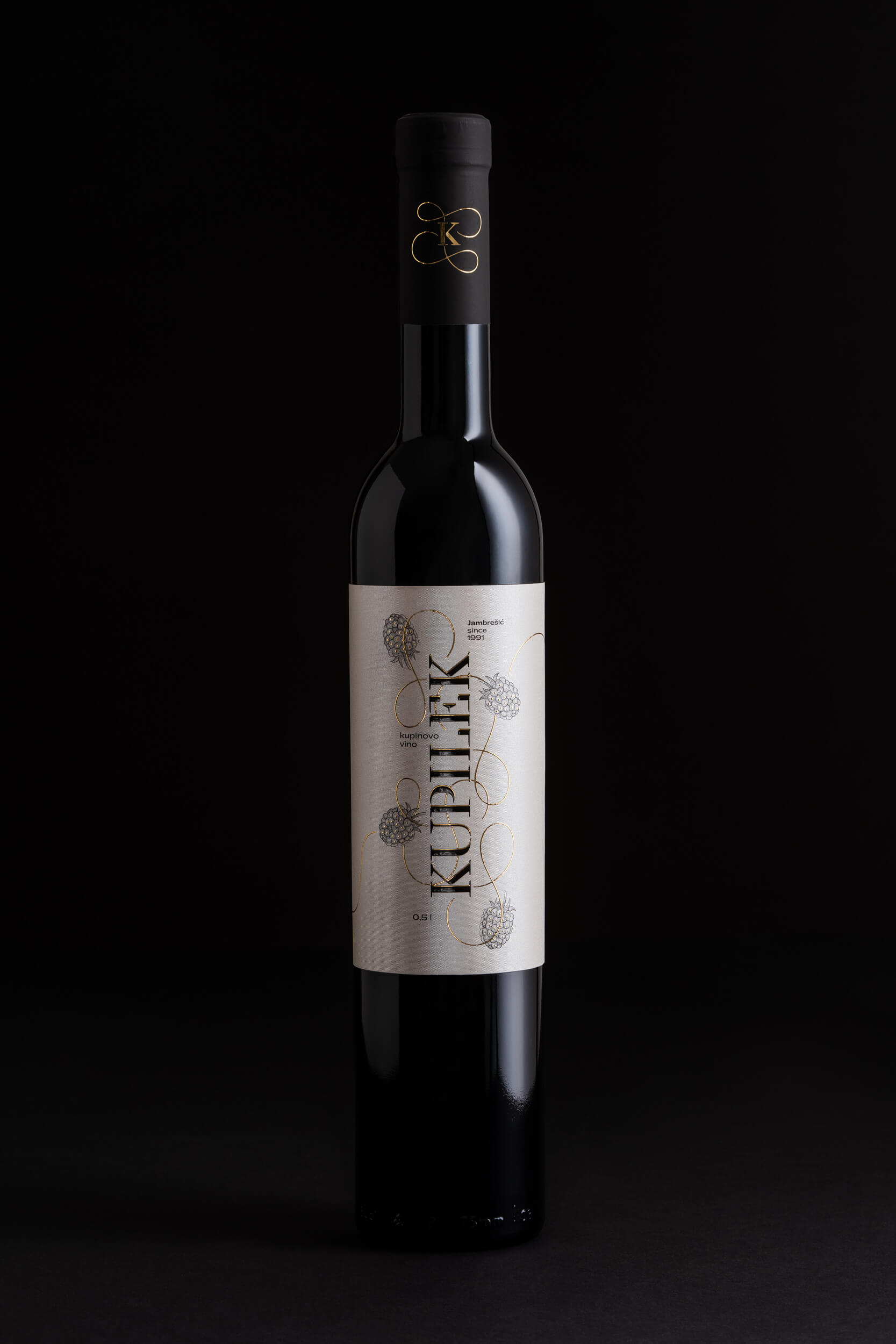
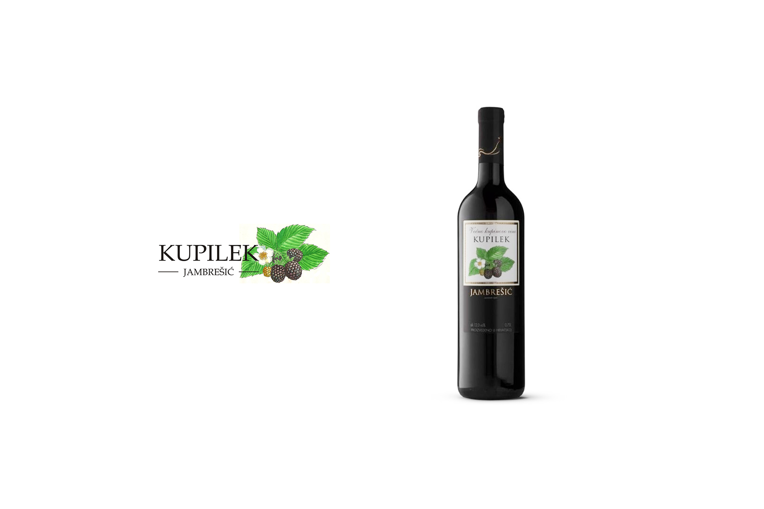
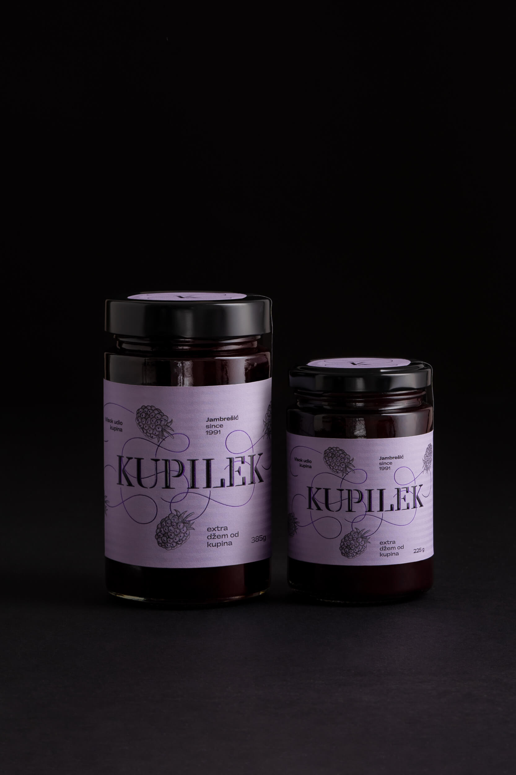
Brand Kupilek / Jambrešić has been operating successfully on the market for 30 years, with its production and retail outlets. It is the largest producer of blackberry products in Croatia.
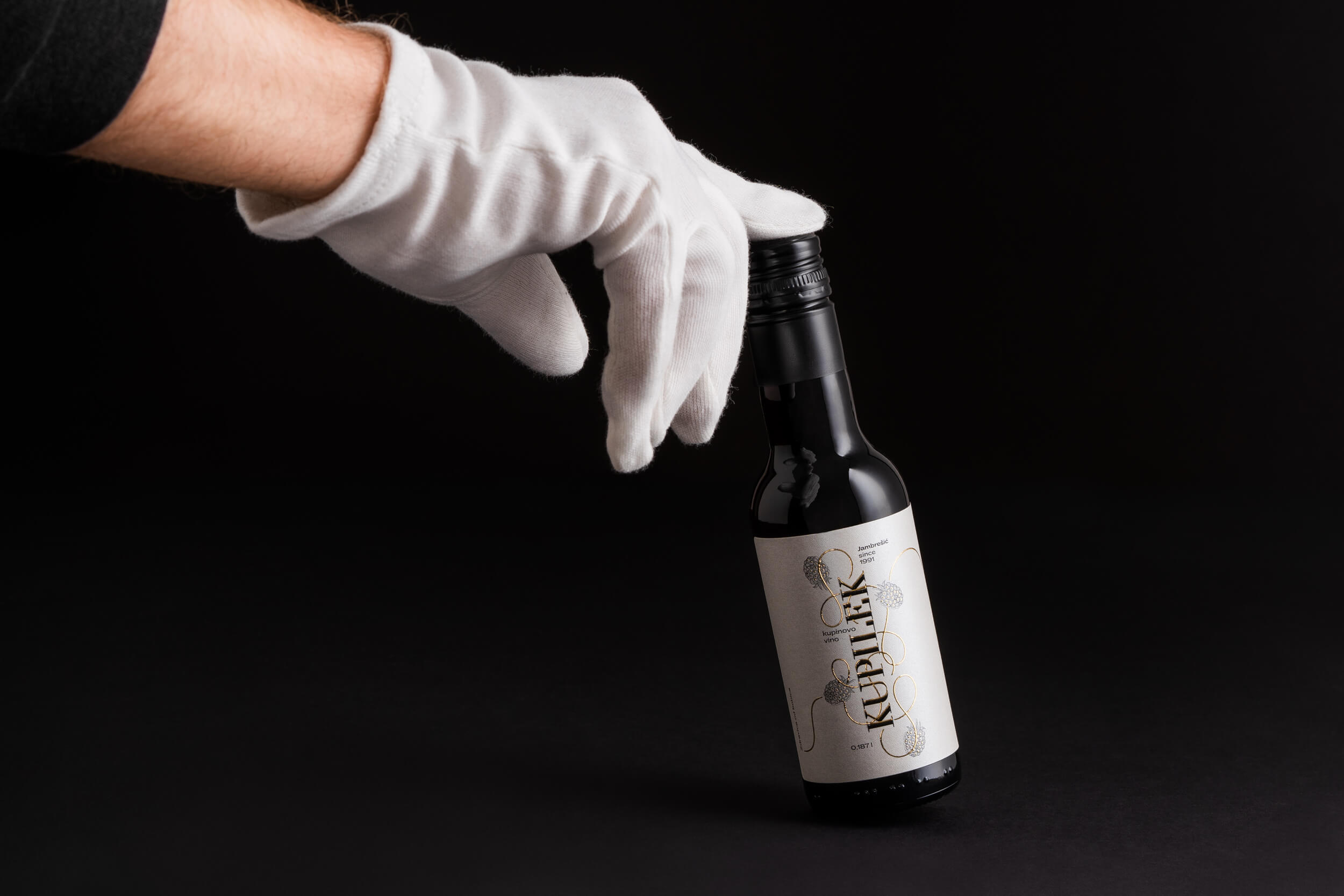
The redesign aims to increase the brand’s visibility on the market and bring the products closer to younger generations and those not so familiar with the beneficial properties of natural blackberry products. The primary objective of rebranding Kupilek blackberry wine and raspberry wine is a clearer positioning of these products in the wine market segment since they are produced the same way as wine from grapes. Most other producers process this culture as liqueurs. Unlike liqueurs, blackberry wine has less sugar and is rich in iron and vitamins.
The redesign includes product and market analysis, setting the strategy and direction of communication, creating slogans and basic verbal communication, and redesigning the brand and visual identity of the product group. From the aspect of design and communication, the main goal is to raise the product to a premium level, retain existing customers of the older generation (40+), attract new customers of the younger generation (25 – 40), and create a product relevant to the segment of Croatian tourism and business gifts.
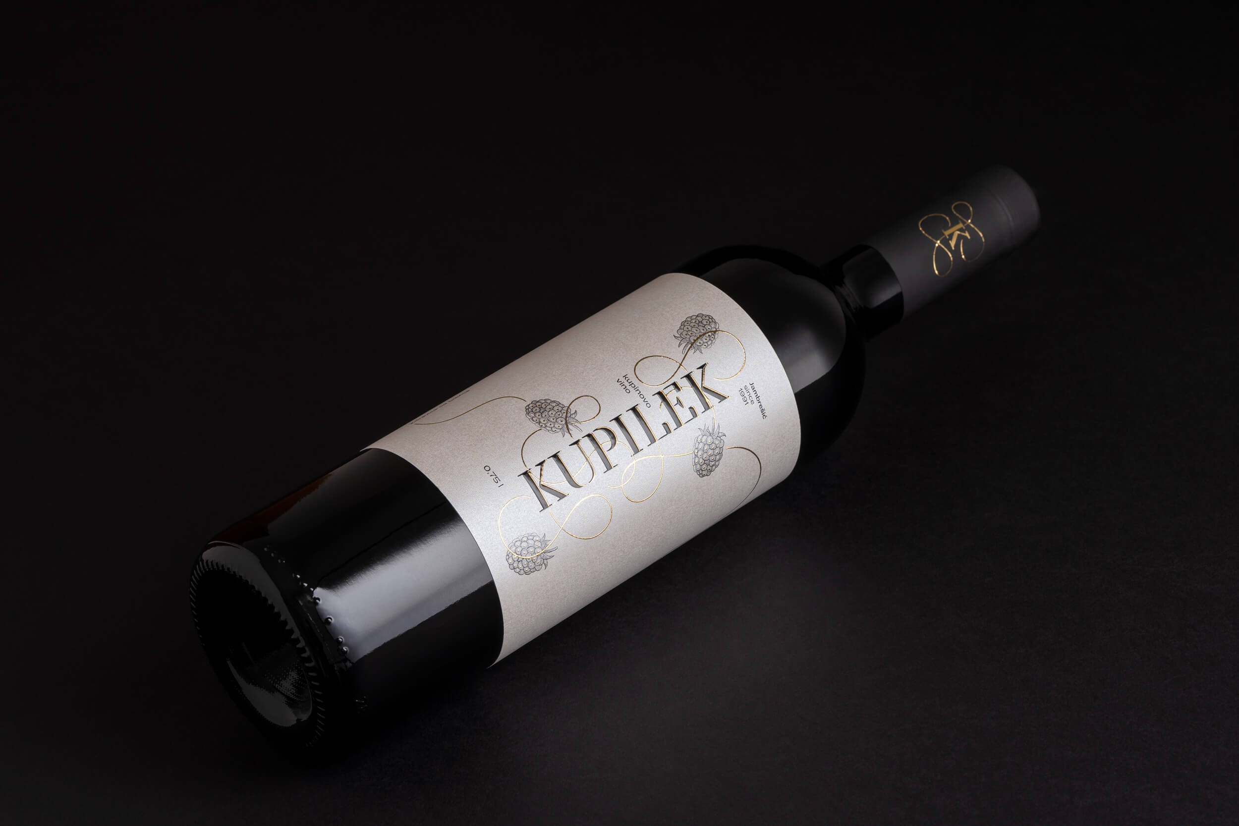
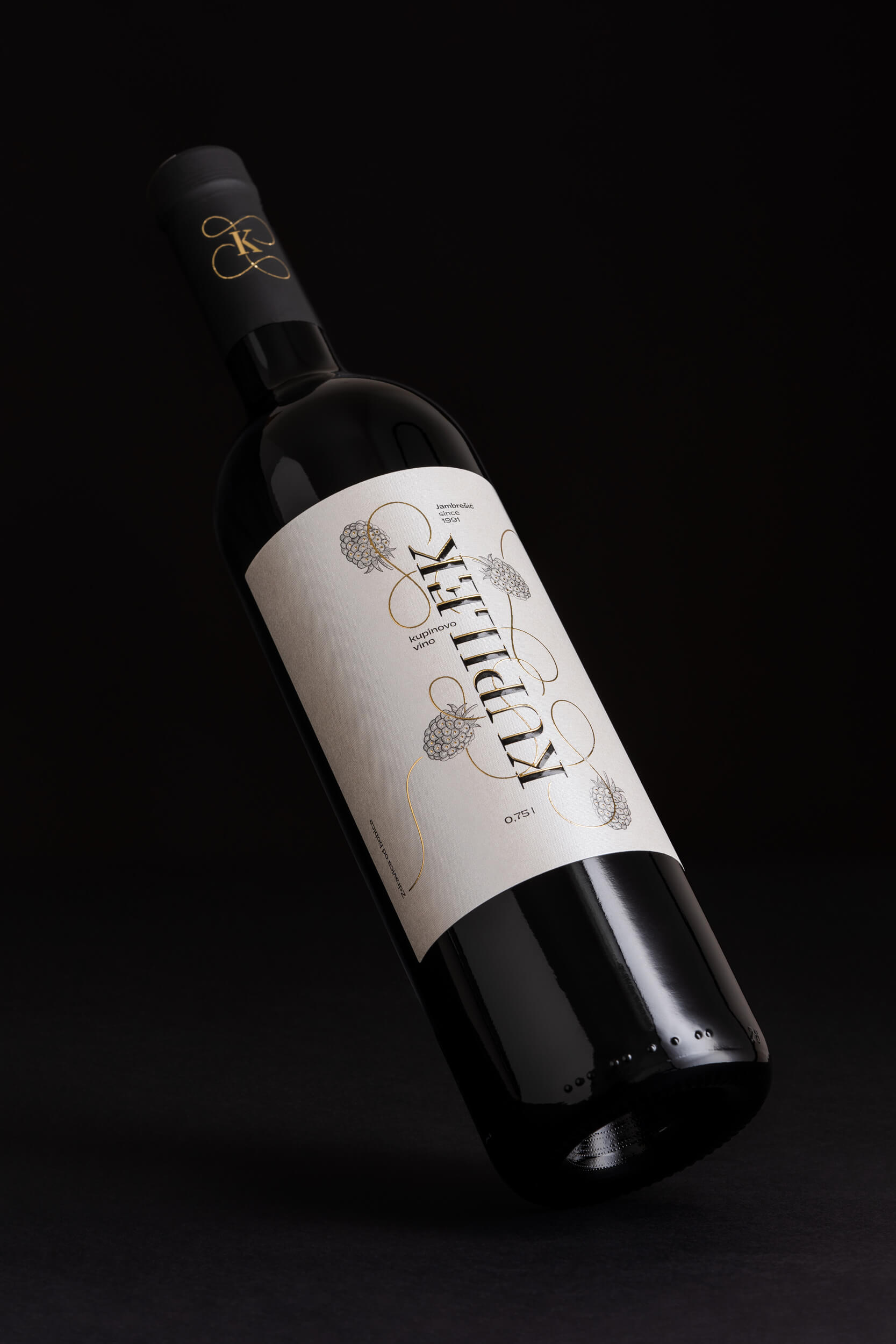
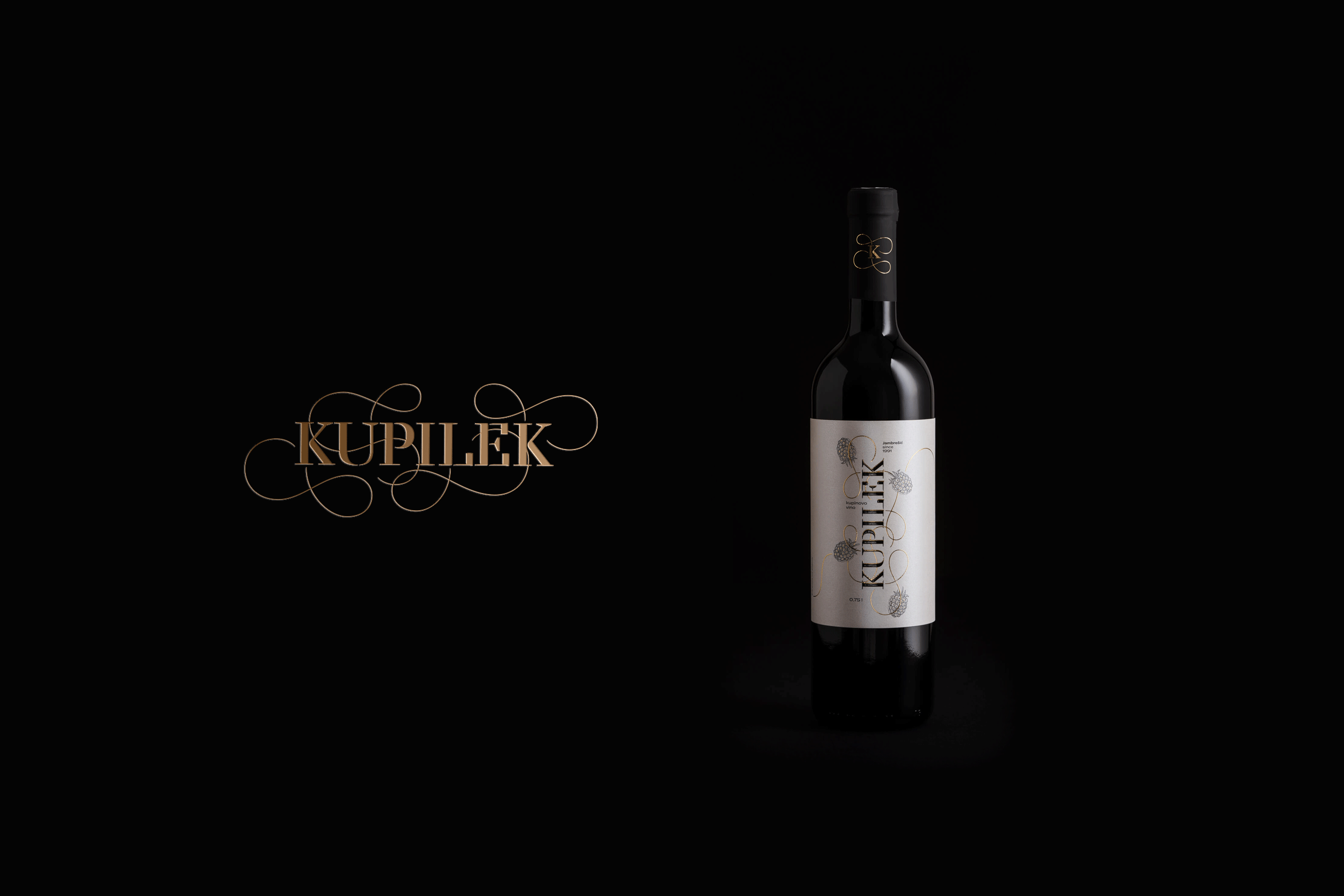
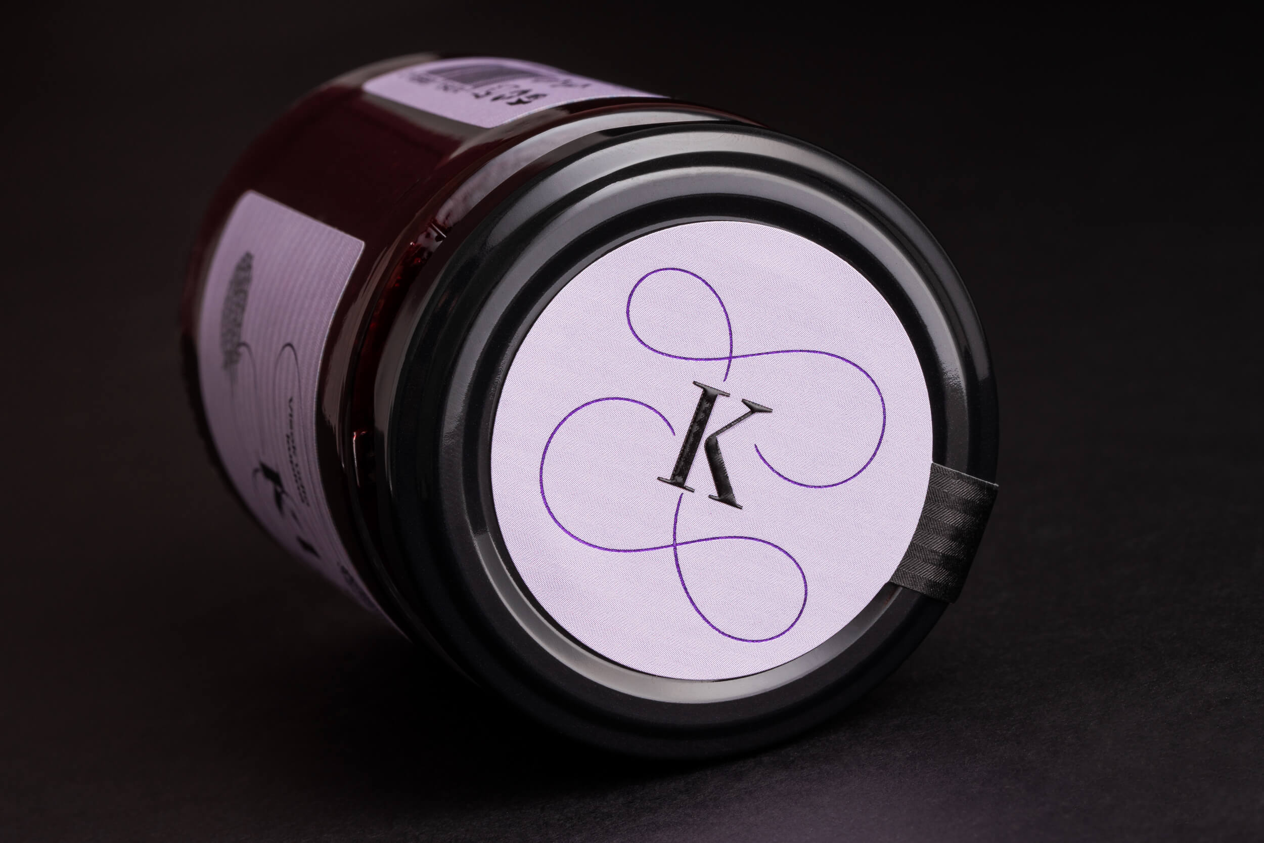
Rebranding puts the brand name – Kupilek in the foreground. The surname Jambrešić is secondary and will function as a personal “signature” behind the brand in future communication. It has been noticed that users are not aware of the brand name since the surname Jambrešić and the brand name are almost equally represented on the previous packaging.
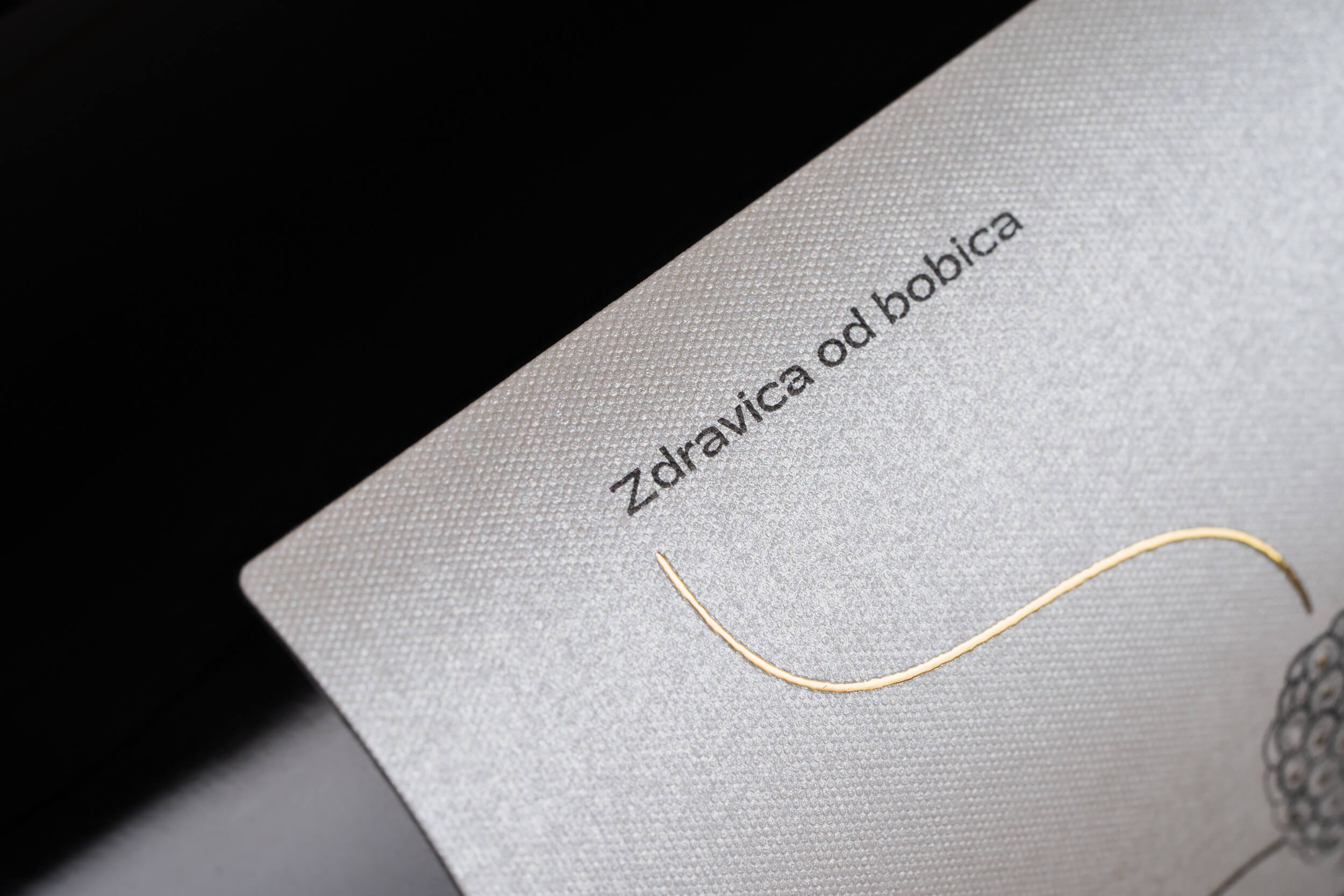
The brand slogan “Zdravica od bobica” (which can be loosely translated as “A healthy salute made from berries”) has also been designed to creatively communicate the health benefits of products within the legal restrictions of such communication.
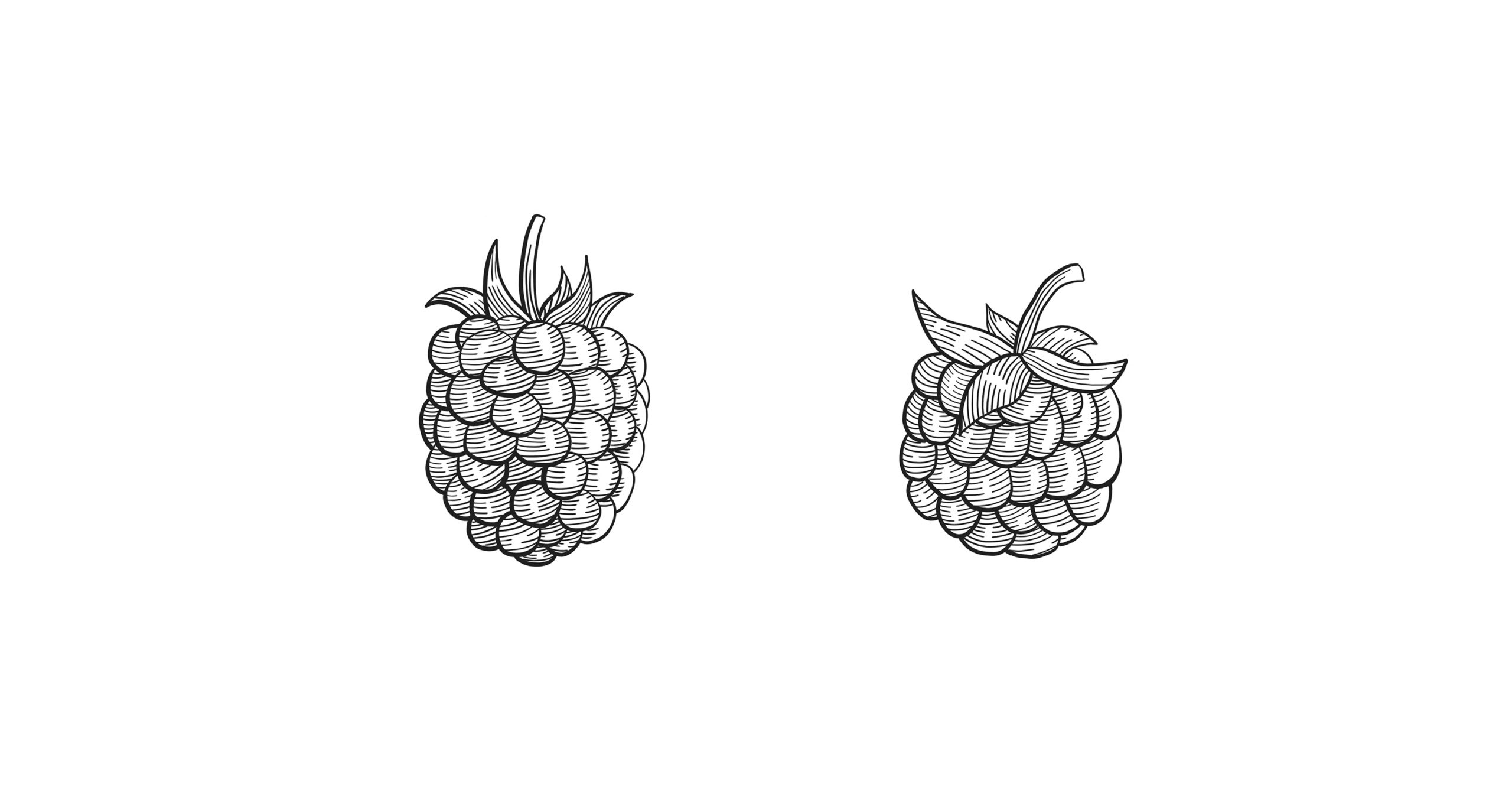
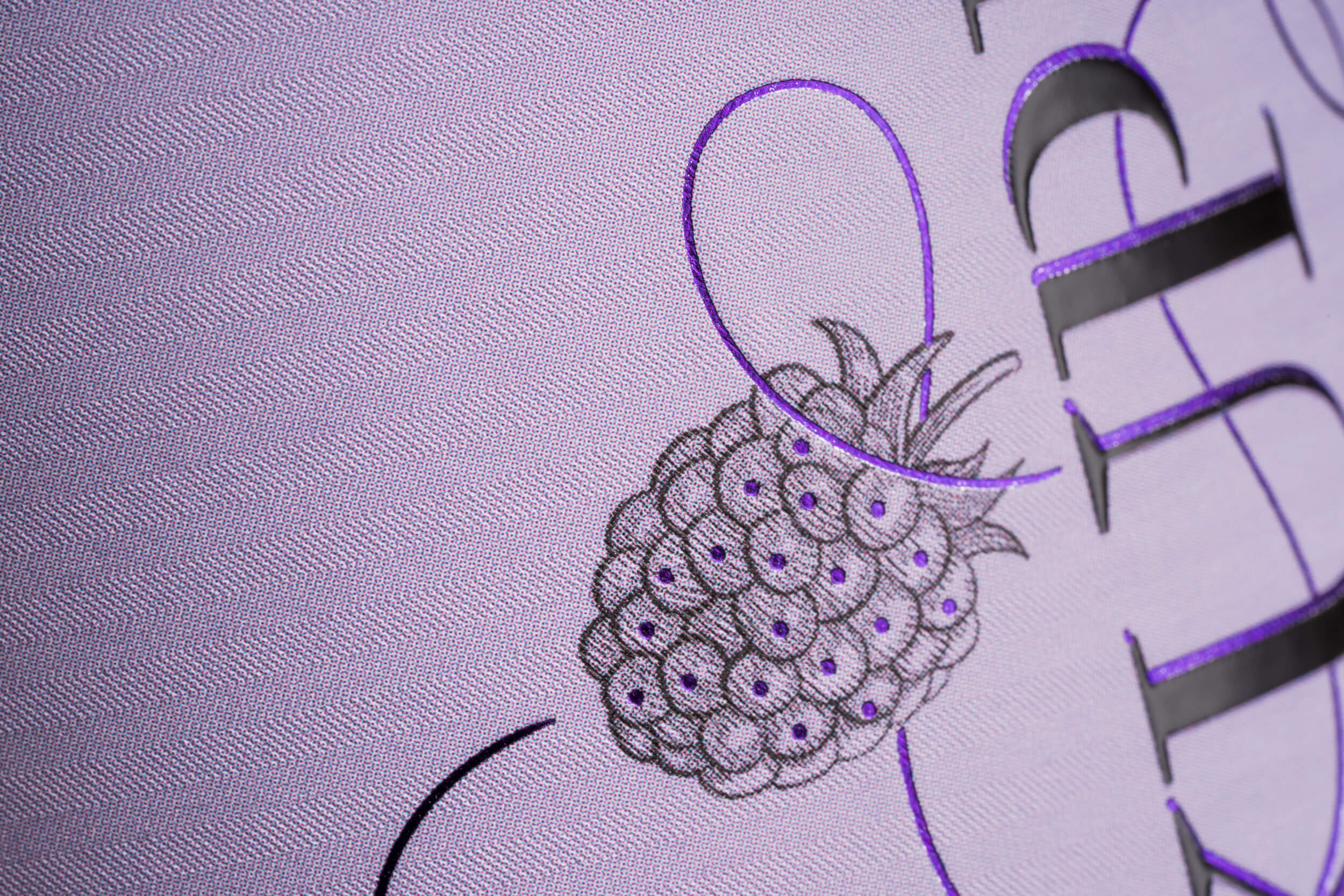
Fruits and tendrils are the foundation of visuals. They are symbols of the richness of fruits and flavors and stem from the centrally positioned brand name. Thus designed, the visual motif communicates the product’s high fruit content and its top quality.