
Kaštil Slanica rebranding
verbal communication / visual identity / promotional materials
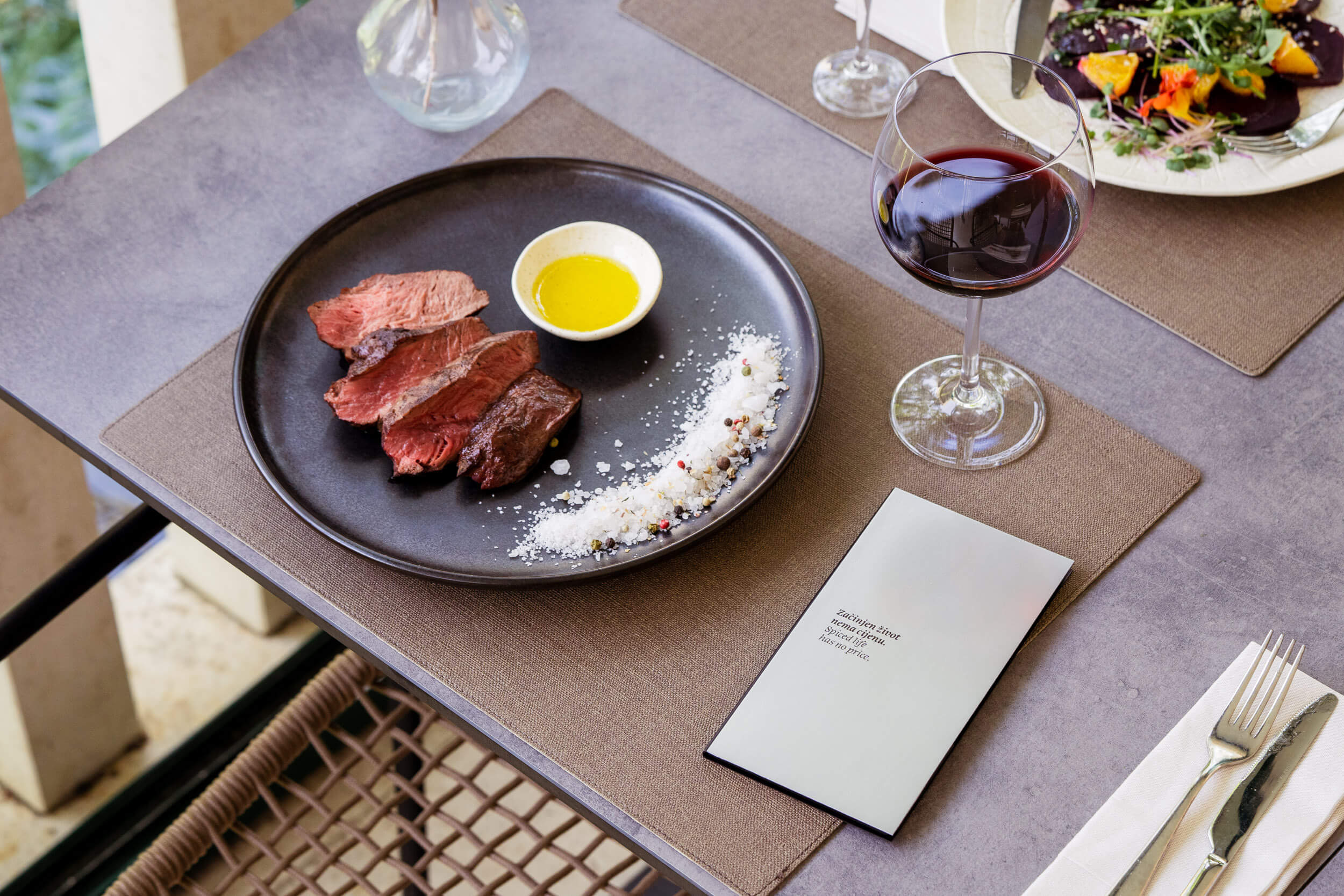
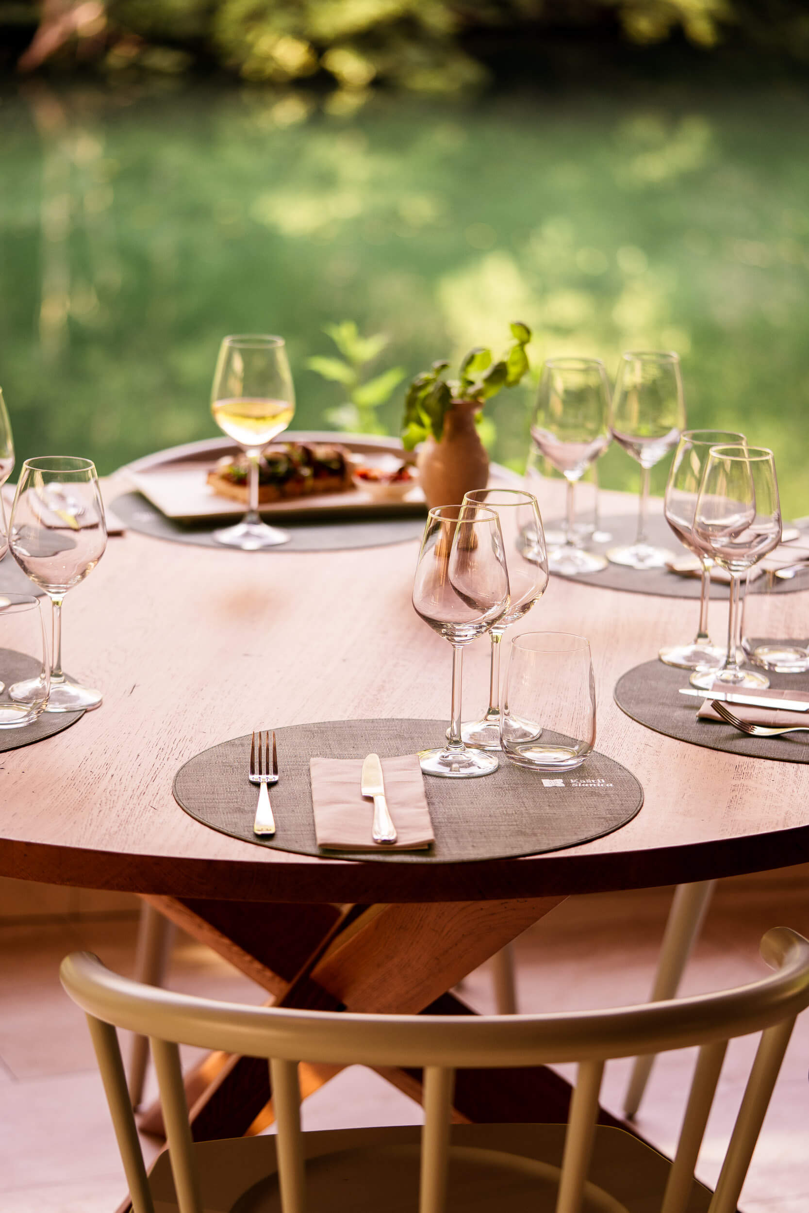
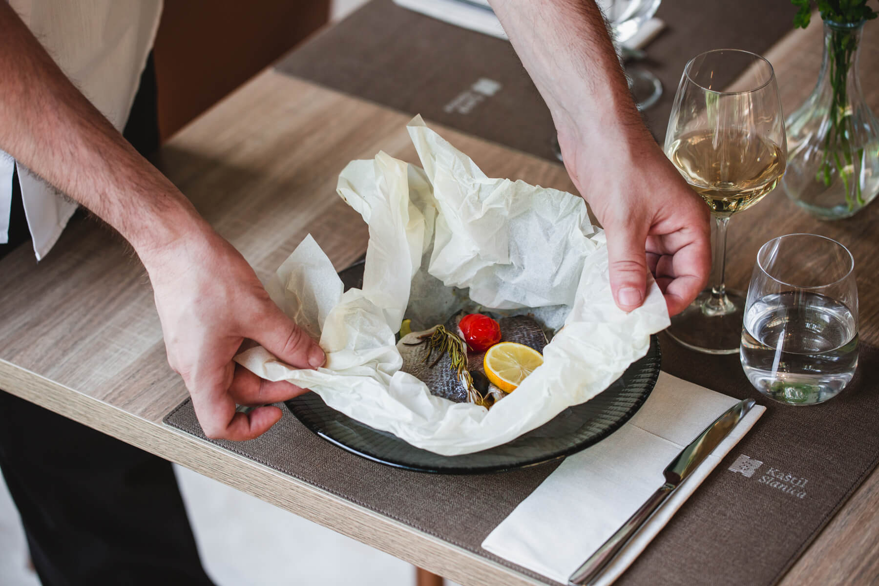
Kaštil Slanica is a family-owned restaurant with more than 25 years of tradition. It offers local specialties prepared in a superior way, which guests can enjoy at an exceptional location in the heart of the Cetina River canyon.
The restaurant wants to attract not only local patrons, but also tourists who visit the area of Omiš, Dalmatian hinterland, and Central Dalmatia and larger organized groups that come through travel agencies or for congresses and similar business events.
The rebranding aims to define a new verbal and visual identity that will communicate the restaurant’s values at a higher premium level, combining tradition with gastronomy based on local recipes, top-notch local ingredients, and indigenous varieties. Kaštil Slanica, as a place that combines catering, nature, local history, and family tradition into one complete story. A must-visit spot in the experience of cultural and historical heritage and natural riches of the destination.
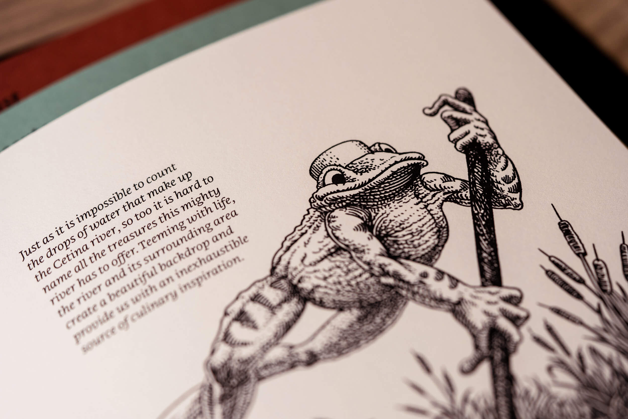
The restaurant is located on the family’s ancestral home, an old mill and a salt market dating back to the 16th century, a small fortress accessed from the river, sea, and land. Even today, it is possible to reach Kaštil Slanica by boat along the river Cetina and experience firsthand the rich flora and fauna of this area.
In addition to the rich tradition of the place, the family owns many valuable historical artifacts that are an important part of the experience of the place (stone mill, tools, historical photographs, maps, and recipes, etc.).
Client
- Kaštil Slanica
Creative team
- Izvorka Jurić (creative and art directore), Jelena Gvozdanović (verbal communication), Jurica Kos, Izvorka Jurić (design), Vedran Klemens (illustration), Natalija Najjar (production manager), Jurica Kos, Lili Bašić (presentation photography)


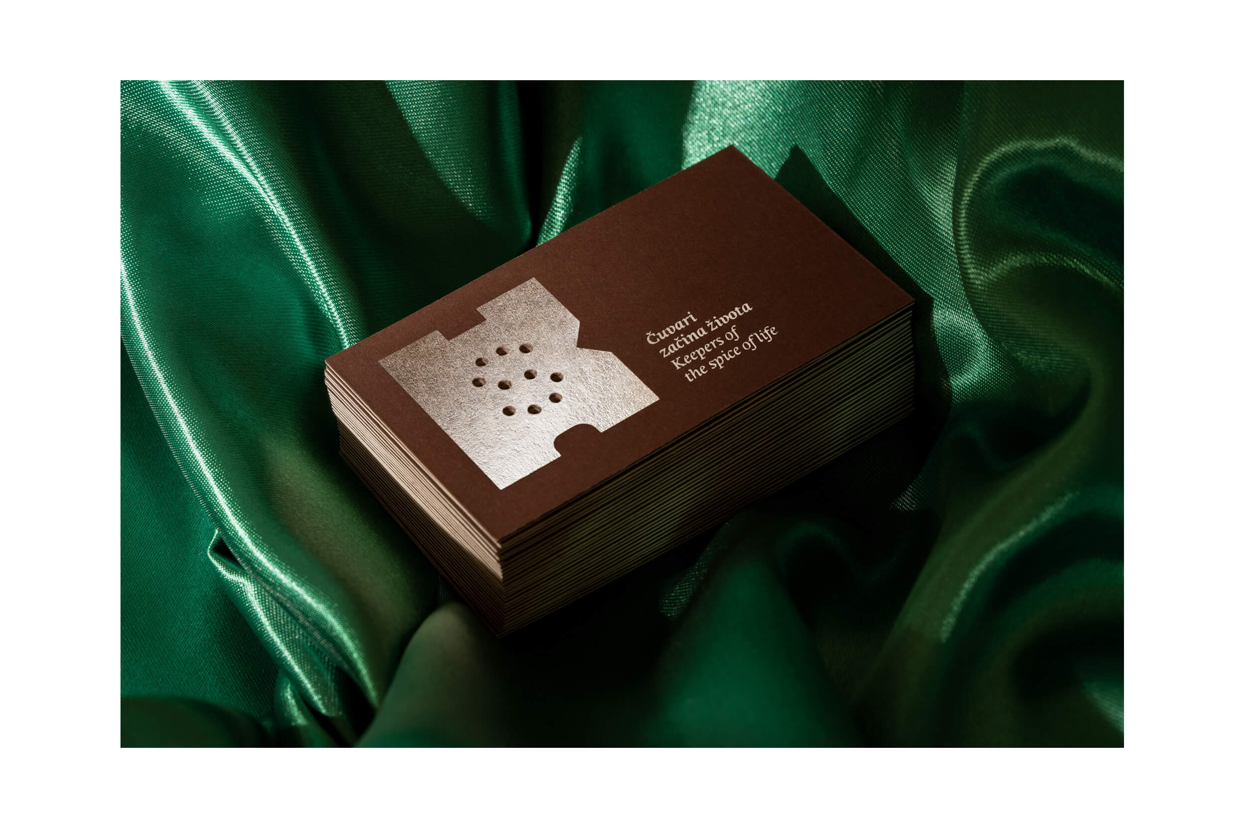
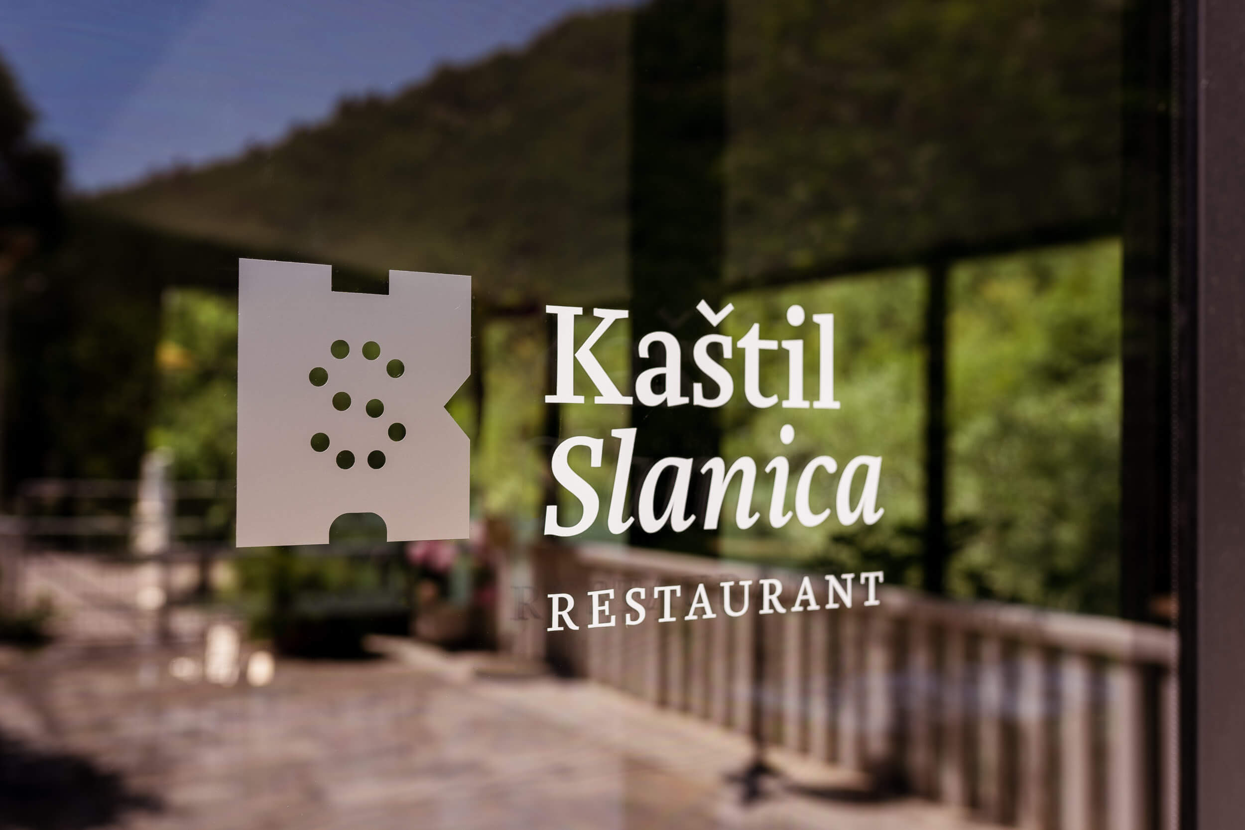
The main motif combination retains the existing motif – Kaštil (“castle” in Croatian), adding an element of association with salt – Slanica (“place of salt” in Croatian), and saltshakers as an association with the gastronomic offer – restaurant. Thus, is composed of the initials of the name Kaštil Slanica – K and S.
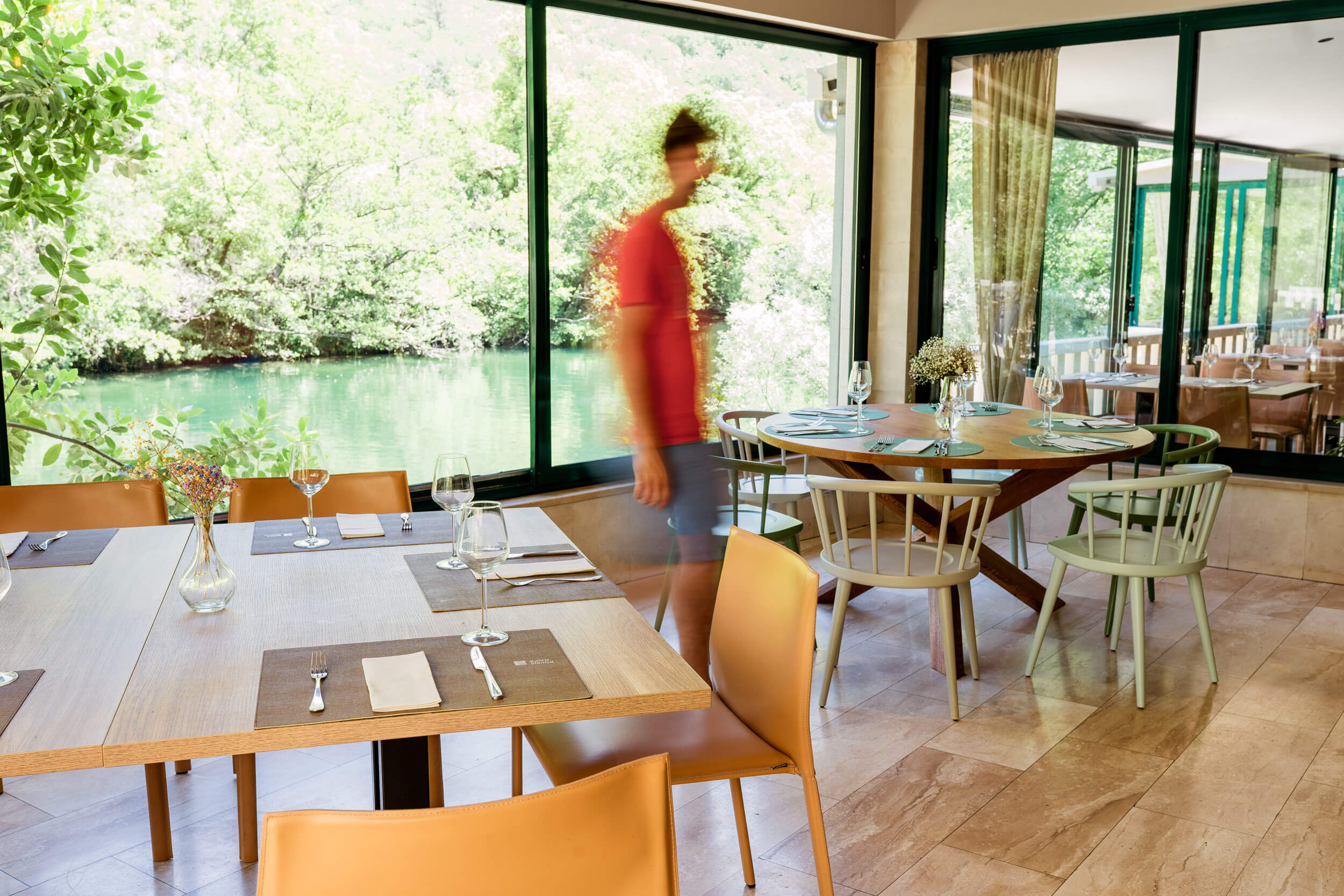
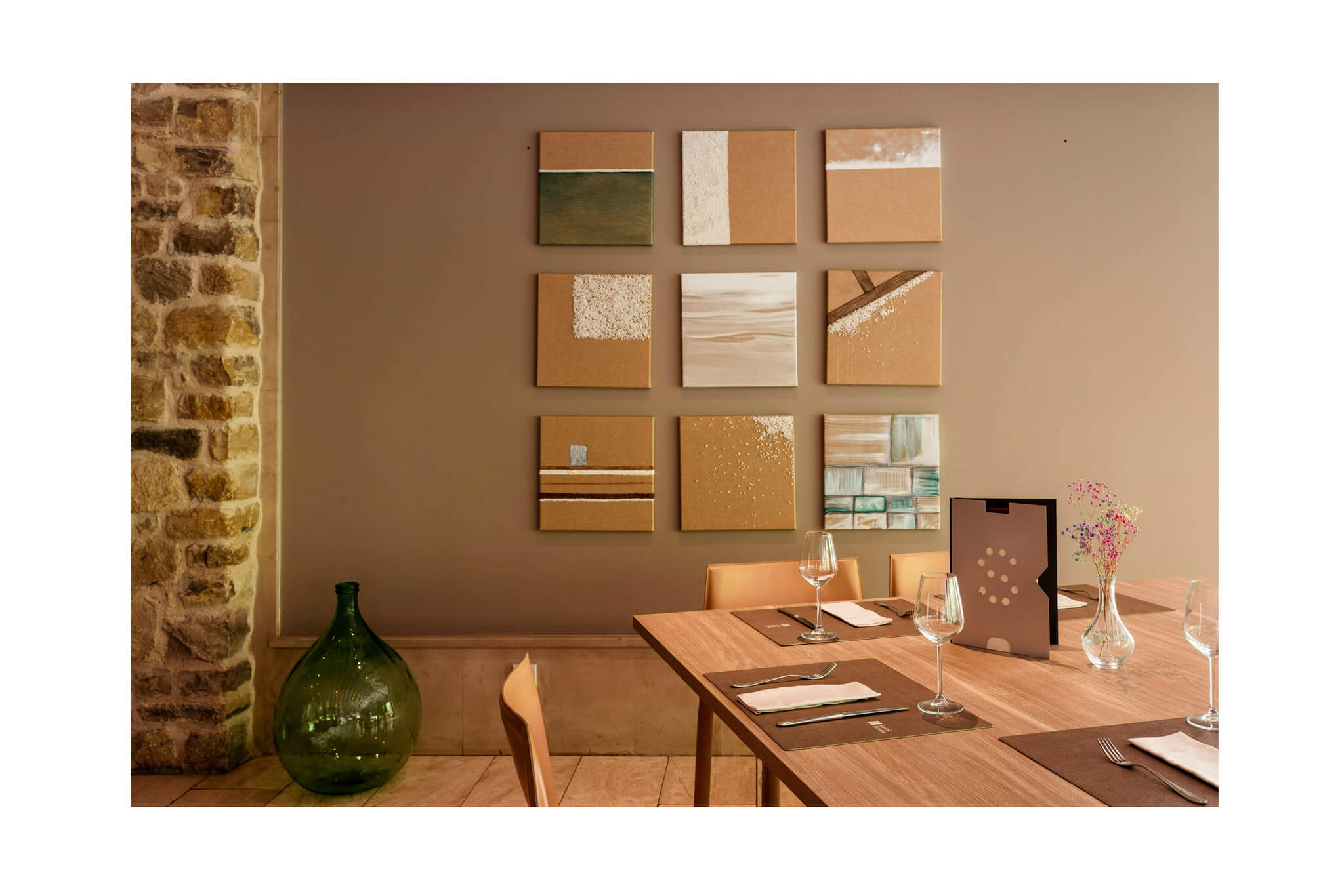
The identity is simple and elegant. The elements and interior communicate emotion, tradition, local gastronomy. and natural beauty through colors and materials. Identity lays the foundation for indented communication, builds the story dramatically but emotionally and temptingly, and enables the upgrade of Kaštil Slanice services.


Keepers of the spice of life
The restaurant‘s slogan is about a family that has run Slanica for generations and acts as a guardian of tradition and Dalmatian gastronomy. It also points to the restaurant’s overall diverse offering as a “spice of life” – what makes life interesting, exciting, enjoyable, or valuable.


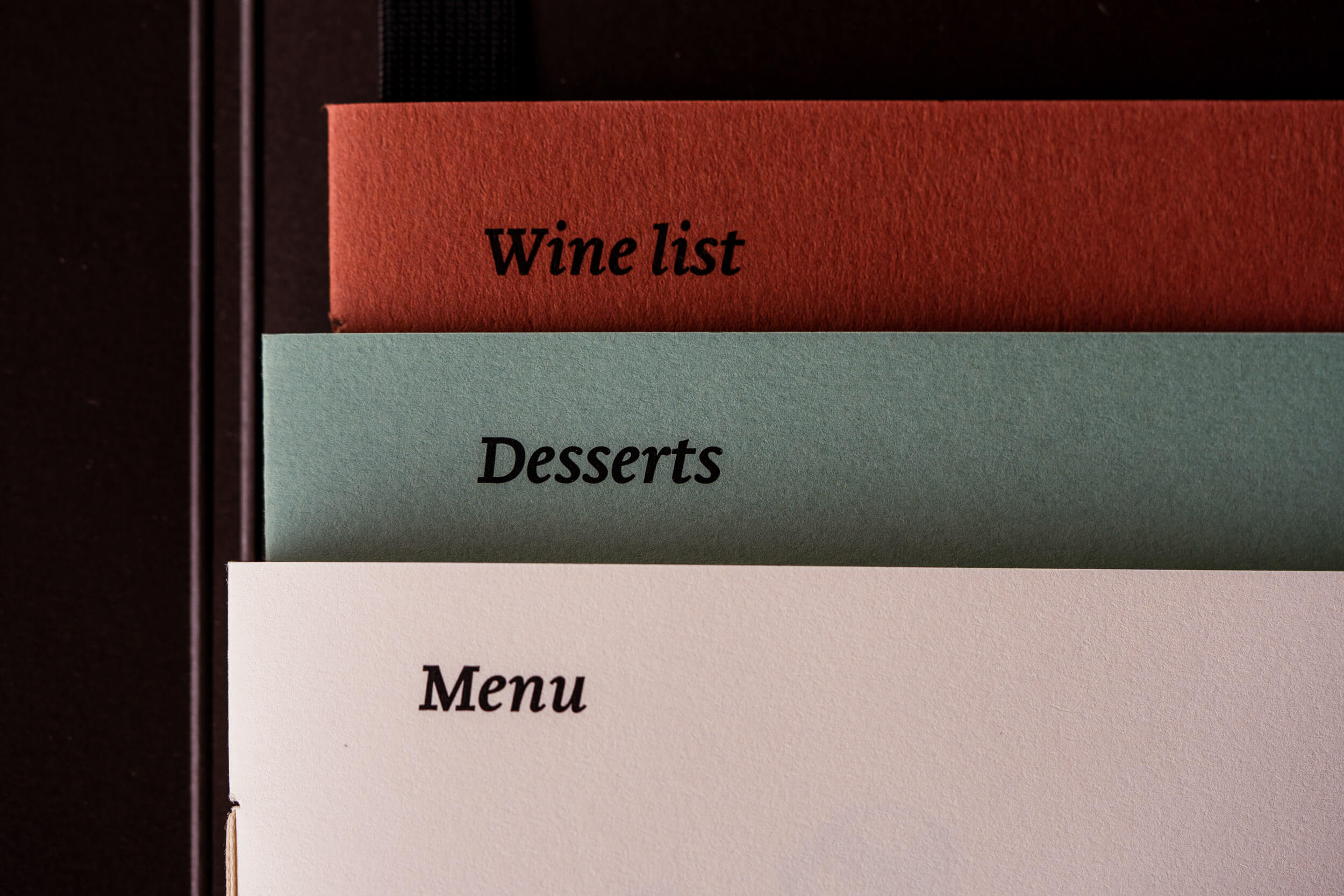
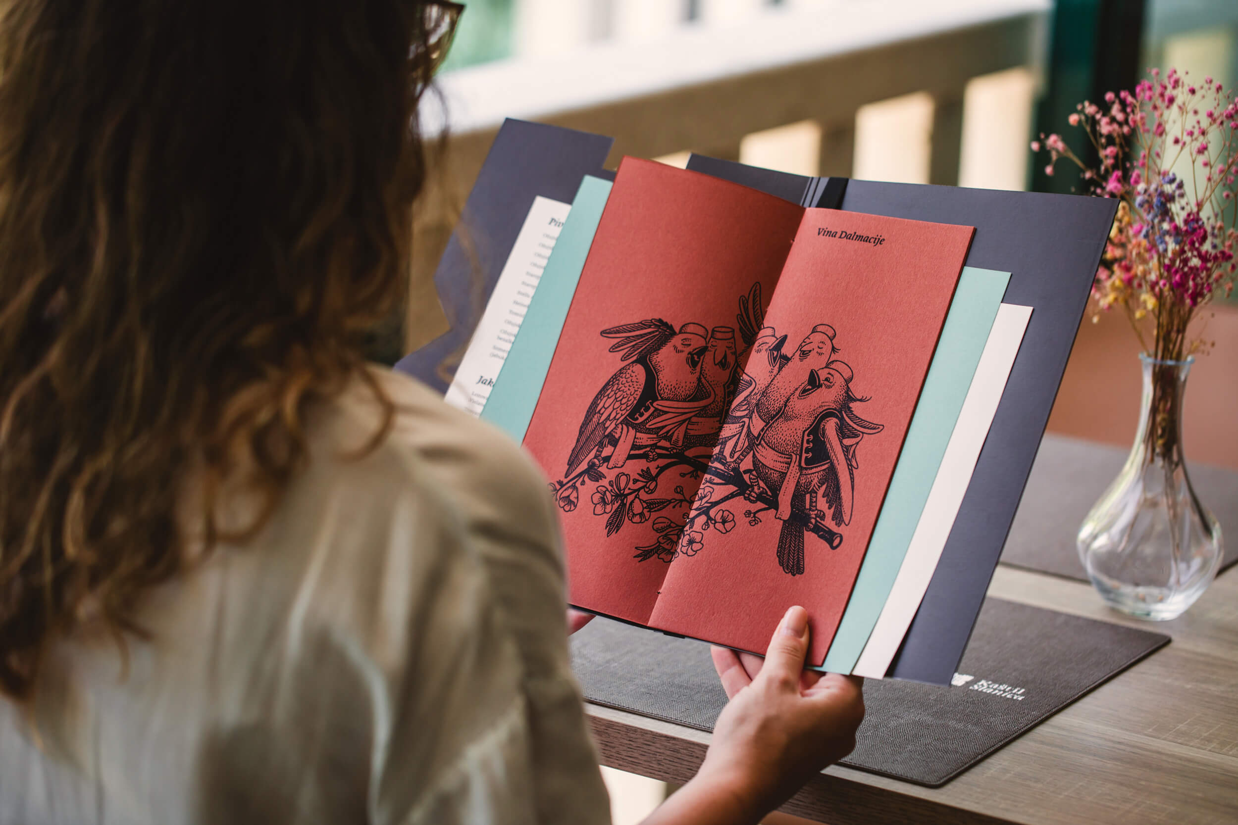
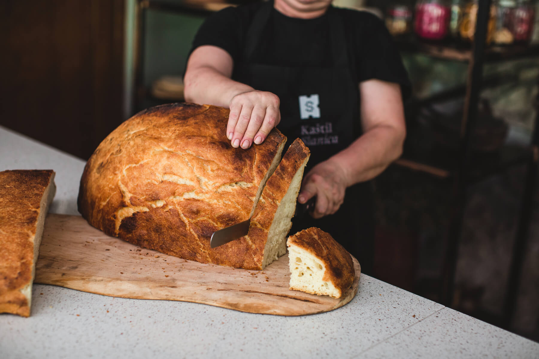
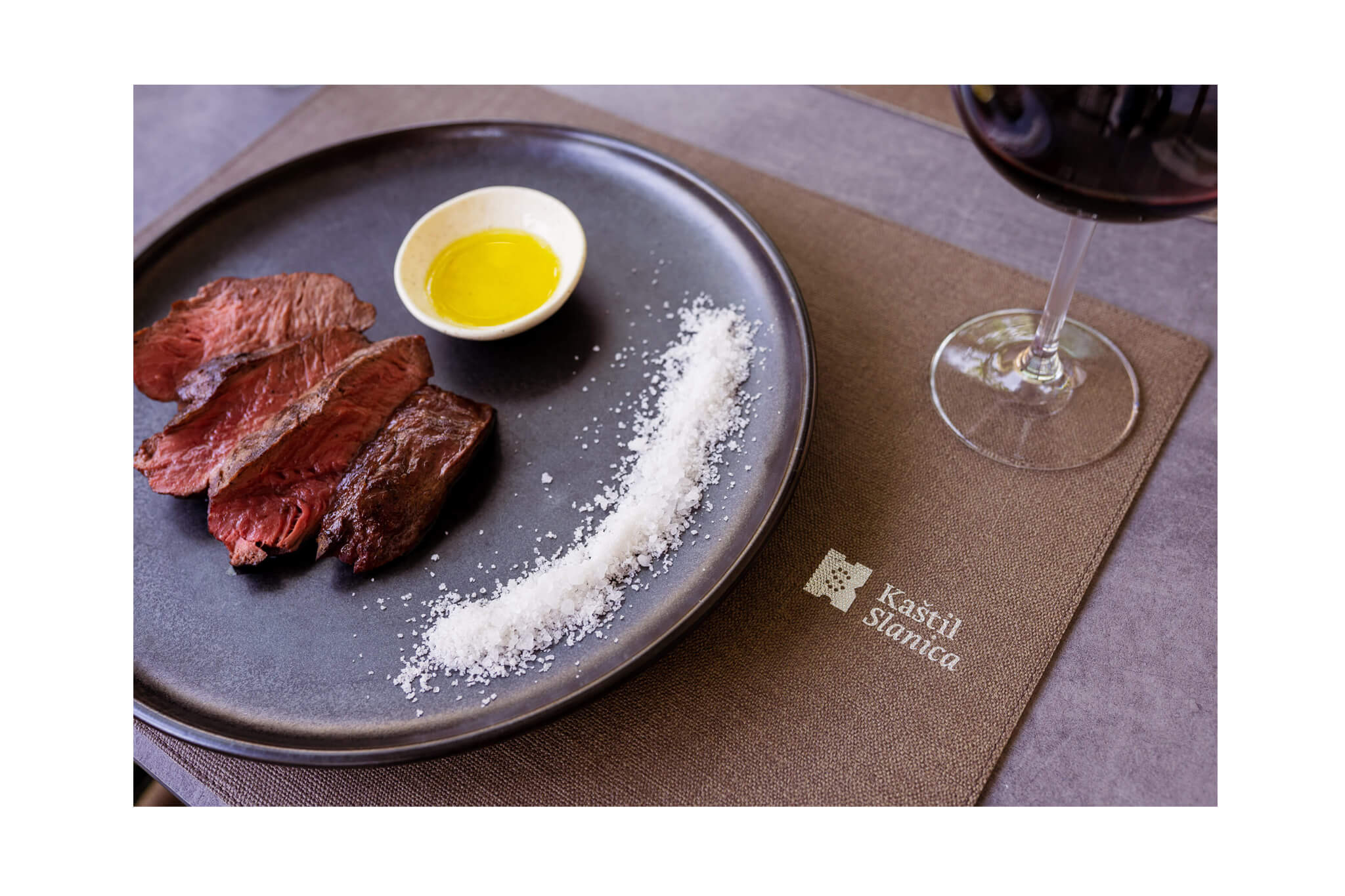
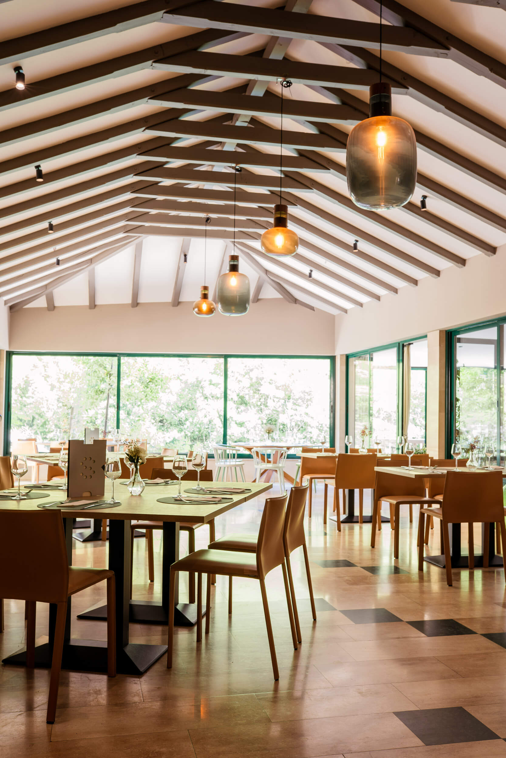
The menu and promotional materials are supplemented with illustrations and text that together convey the stories of the locality and the gastronomic offer. The project also includes the design of restaurant equipment, photos of dishes and table settings, design of souvenir offers, internal and external signage and branding of specific elements of the space.


Awards and honors
_
featured project on Behance – Branding
2023, International
_
published in book Pregled hrvatskog dizajna 21/22
Croatian Designers Society, 2022, CRO
_
part of “Exhibition of Croatian Design 21/22”
Croatian Designers Society, 2022, CRO
_
Logo redesign WOLDA 13 Gold Award
2022, International
_
published on CardDsgn
2022, International
_
bronze award in the Rebranding category IdejaX Best Branding & Rebranding
2022, Croatia