
TREF premium lager beer
product identity / packaging
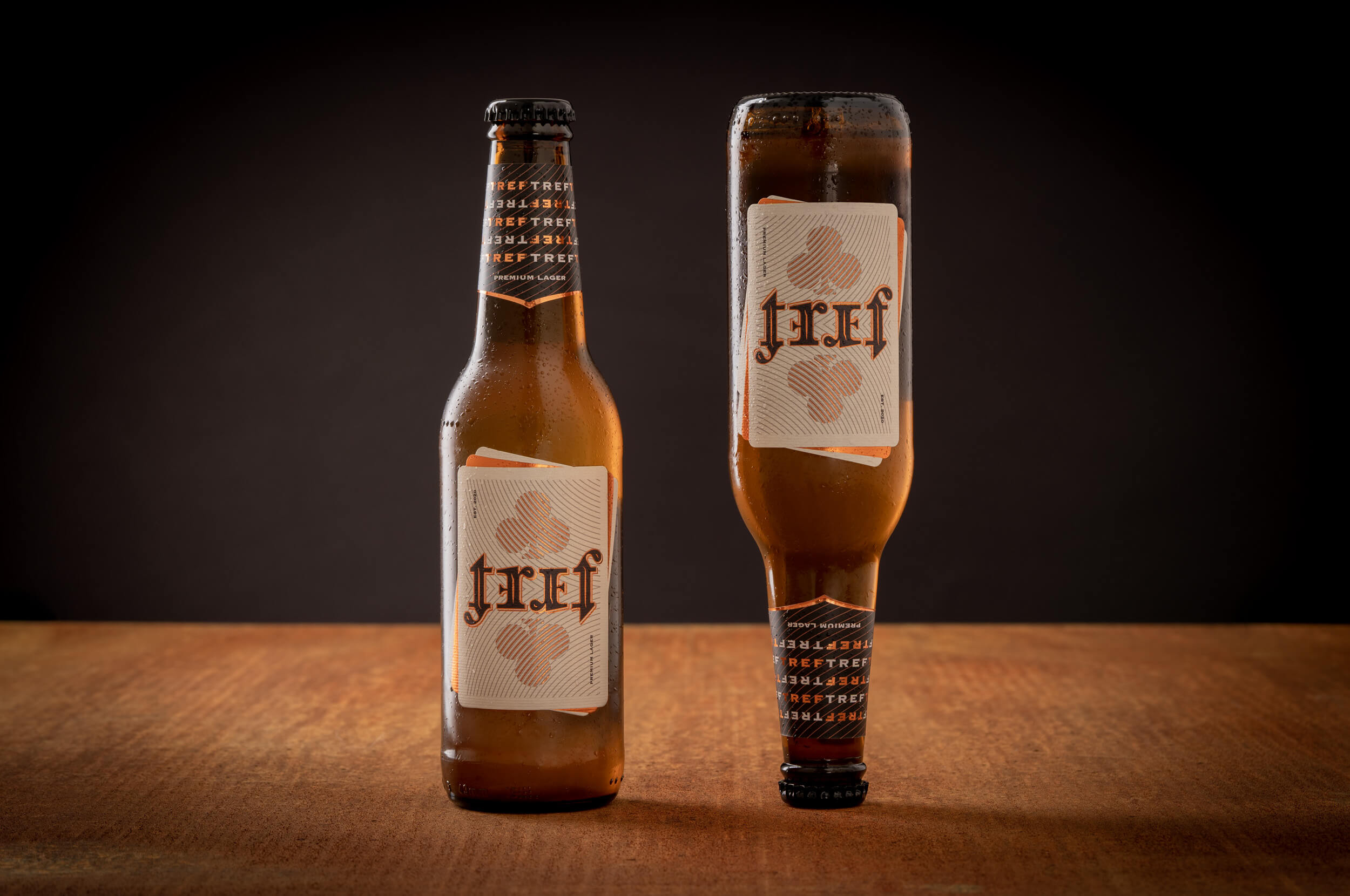
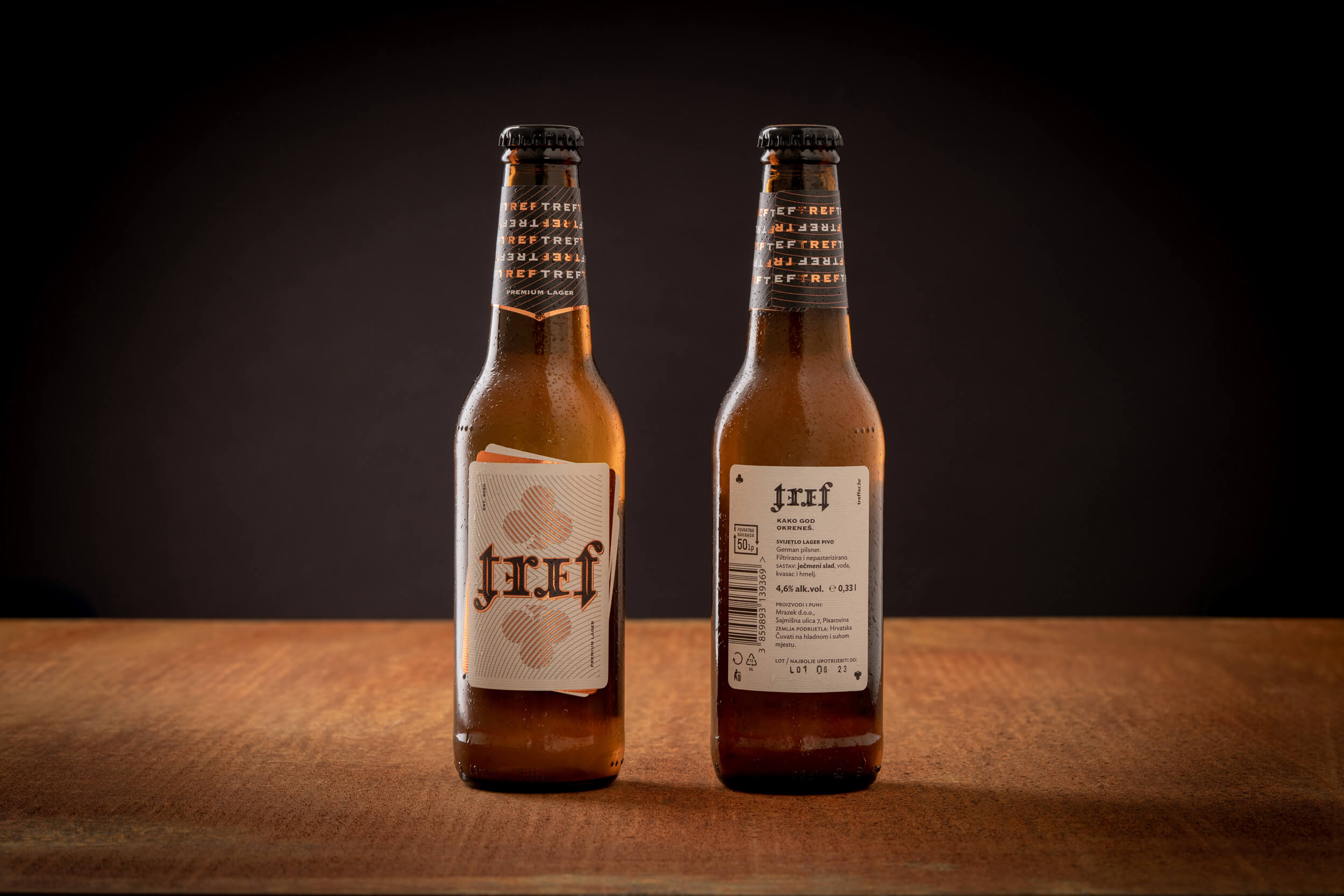
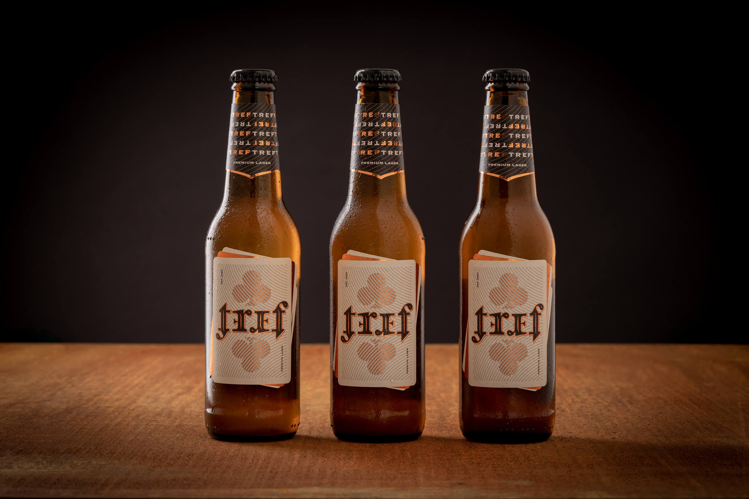
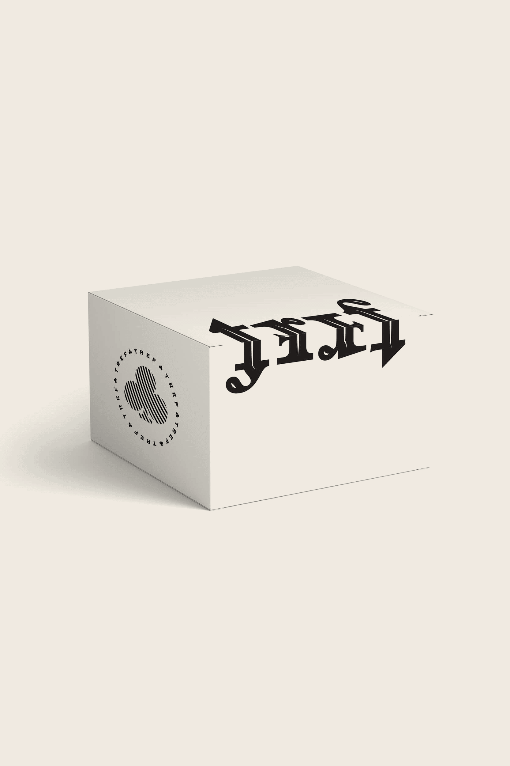
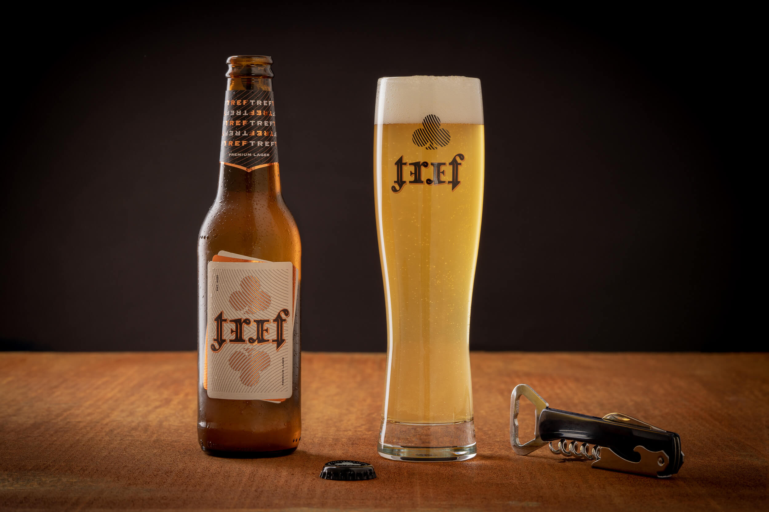
TREF is a premium lager for young people who like naturally produced, drinkable beer. As a new product on the market, communication, and design maximize the name’s visibility and draw attention to the product’s story with design innovation.
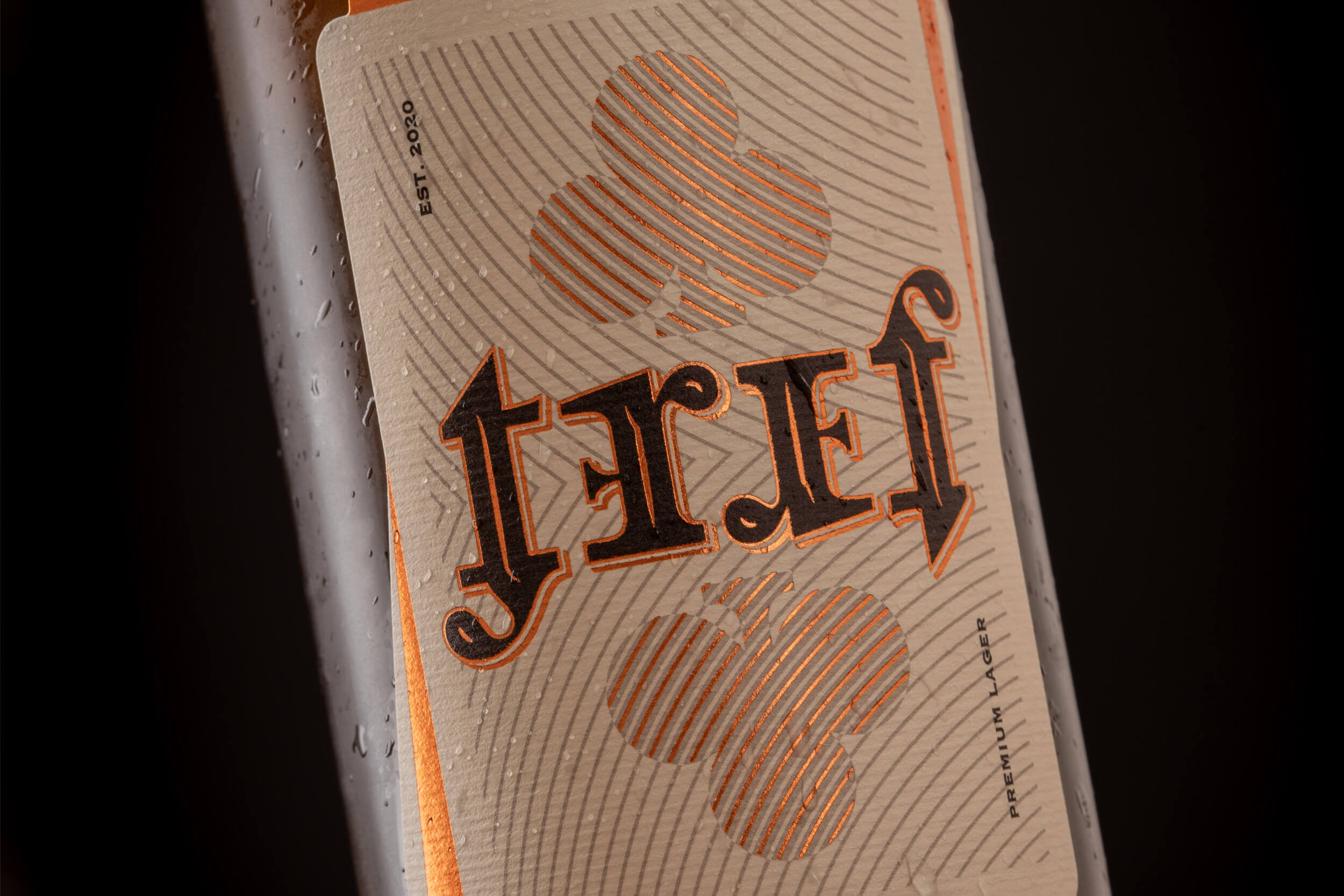
Playing cards and their vertical symmetry are logically imposed as direction. So, the brand is designed as an ambigram logo — a designed word that reads the same when turned upside down. The design conveys associations with the phrases “You were dealt a good hand” or “lucky deal”. Eternal optimists whose glass is always half full and only lose in poker if they don’t have a good time will find themselves in the slogan “Either way”.
The selection of the scale of colors, materials, and techniques positions the product in the premium segment, with the necessary balance between the design of the classic approach of lager and craft beer design.
Client
- Treffer brewery
Creative team
- Izvorka Jurić (creative and art direction), Jurica Kos (design, presentation photography)


Awards and honors
_
finalist in the Design category IdejaX Best of Ad-Making
2023, Croatia
_
published in book The Favourite Design Beer Edition 2022
2022, International
_
published in book Pregled hrvatskog dizajna 21/22
Croatian Designers Society, 2022, CRO
_
part of “Exhibition of Croatian Design 21/22”
Croatian Designers Society, 2022, CRO
_
New logo WOLDA 13 Gold Award
2022, International
_
published on Packaging of the World
2022, International
_
finalist ZGDW Award 2022
Zagreb Design Week, 2022, CRO