
Lintar olive oil
verbal communication / identity / branding / packaging
Lintar olive oil is a result of Cemex Croatia company’s longtime investments in sustainable development. Working together, the company and a local oil refinery implemented a reclamation project by planting indigenous species of olive trees on the southern slopes of the Kozjak Mountain.
They collaborated in all project phases, from the market positioning and product naming strategy to designing the product identity and packaging design. The name Lintar derives from the Greek word for “funnel” – also the old name for the Bay of Kaštela, the geographical origin of the oil.
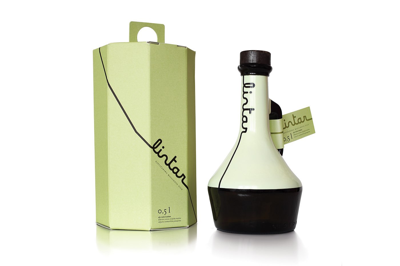
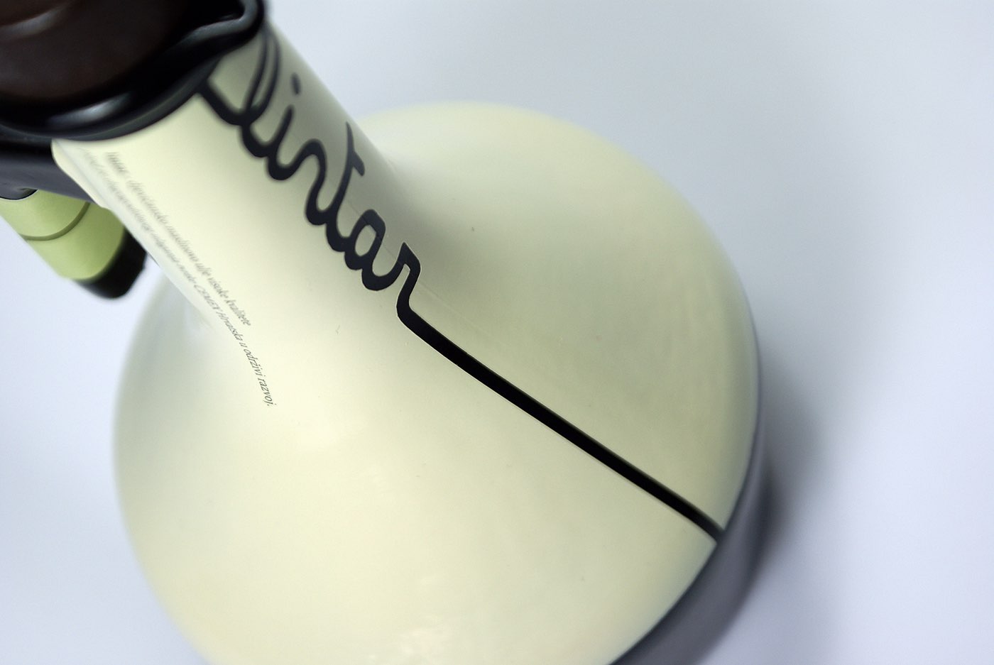
The brand and packaging design was inspired by the shape of a funnel and by the act of pouring liquids. For example, the brand executed using Maline typography interprets an oil line writing a name by pouring down the surface. The bottle has a shape of a funnel. The visual identity of this product combines the traditional and the modern, which is particularly evident in the specific blend of colors and shapes.
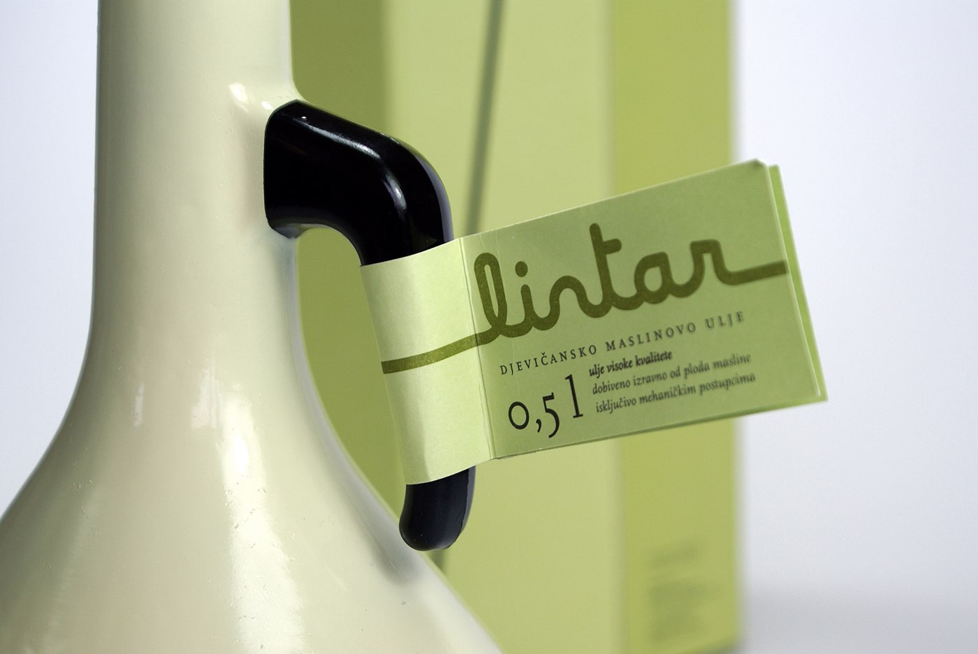
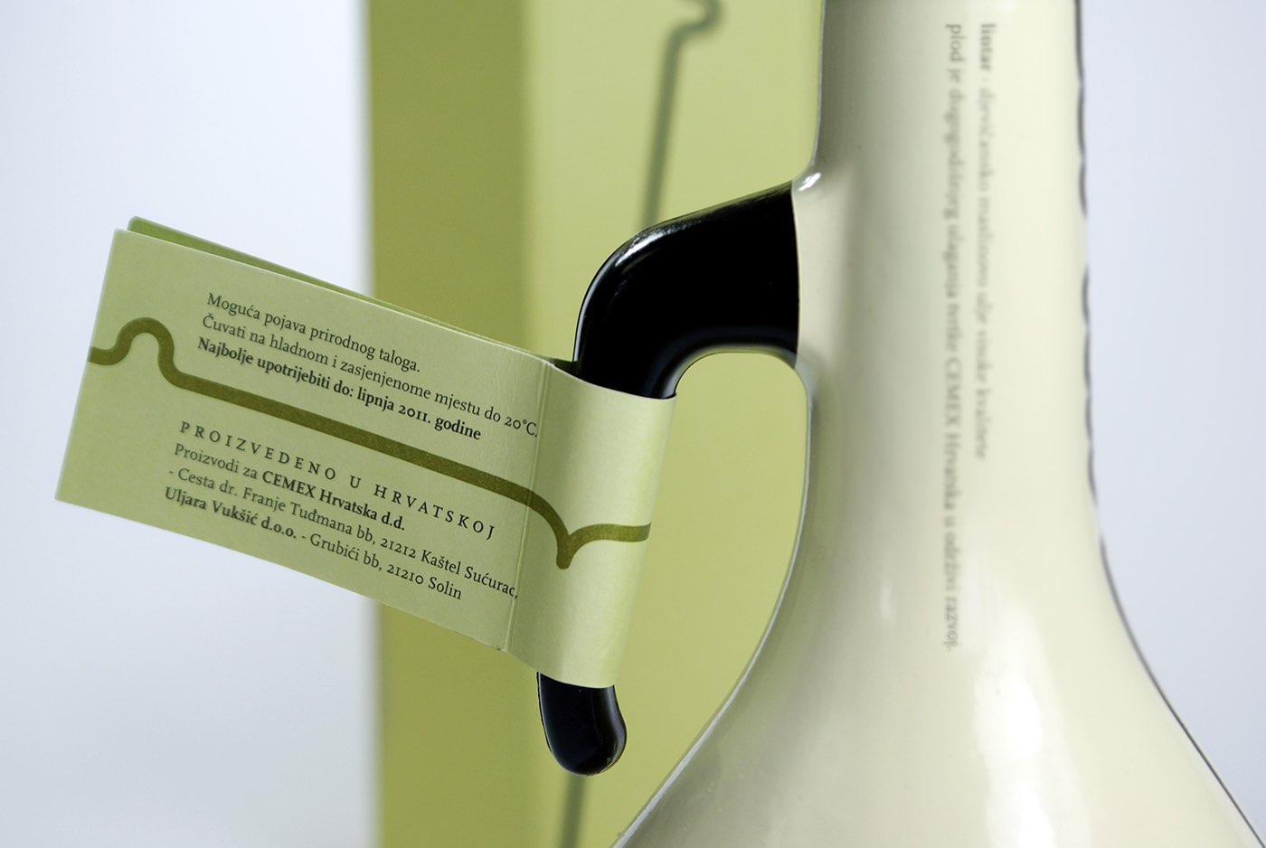
The dark brown glass bottle is hand painted in very light yellow-green tone. Textual elements are printed on the surface. A label, containing the basic information about the product, is attached to the bottle handle. Additional information is printed on the cardboard box with a finger handle.
Client
- CEMEX Hrvatska d.d.
- _
- designed for Tridvajedan
Creative team
- Nelija Rudolfi, Izvorka Jurić (creative strategy), Jelena Gvozdanović (copywriting), Izvorka Jurić (art direction, design), Natalija Najjar (DTP), Nikola Futač (animation)

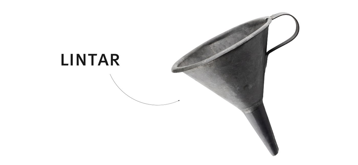
The name Lintar derives from the Greek word for “funnel” – also the old name for the Bay of Kaštela, the geographical origin of the oil.


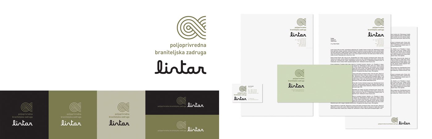
As a result of a long-term investment in sustainable development, CEMEX has established the Lintar Co-operative for reclaiming the areas exploited by the local community, growing agricultural crops (primarily olive oil) and contributing to the preservation of the olive-growing tradition. Given that the members of this co-operative are Croatian Army veterans, the idea was to incorporate one of Croatia’s national symbols into the identity. The identity of the co-operative is a blend of the previously-designed logo of the Lintar brand (olive oil), a stylized symbol of the Croatian three-strand pattern and a palette of the colors associated with agriculture, Croatian veterans and Lintar.

The new solution meets the needs of a more economical and less exclusive Lintar olive oil in the 0.2L – 0.5L category intended for retail outlets. The design relies on the basic elements used in the primary gift packaging. The dark brown glass bottle is sealed with a black metal plug with an integrated funnel.
Awards and honors
_
Red Dot for High Design Quality
Red Dot Design Award: Communication Design, 2010, D
_
Pentawards Gold Award – Luxury Gourment Food
Pentawards, 2010, Worldwide
_
part of “Exhibition of Croatian Design 09/10″
CDS – Croatian Designers Society, 2010, CRO
_
Art Direction Club Croatia Gold in the category of packaging
Art Direction Club Croatia, 2010, CRO
_
published on The Dieline,
2010, Internacional
_
published on The Lovely Package,
2010, Internacional