
Aroma Mediterranea
product line identity / packaging
Aroma Mediterranea soaps are part of a cosmetics line for body and face care. The Aroma Mediterranea line had been available for several years, and, while featuring high-quality products at acceptable prices, it had not achieved expected sales results. Our task was to redesign the existing line – making it more attractive to the target group (tourists, gifts shoppers…) and highlighting the products on the shelves.
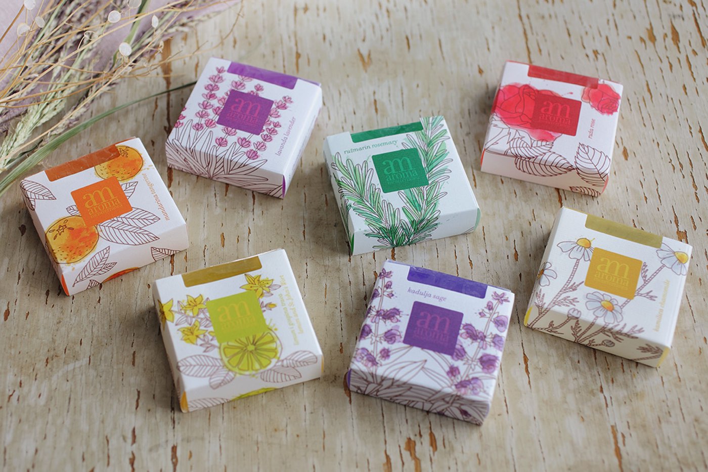
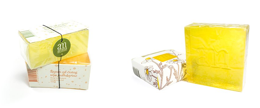
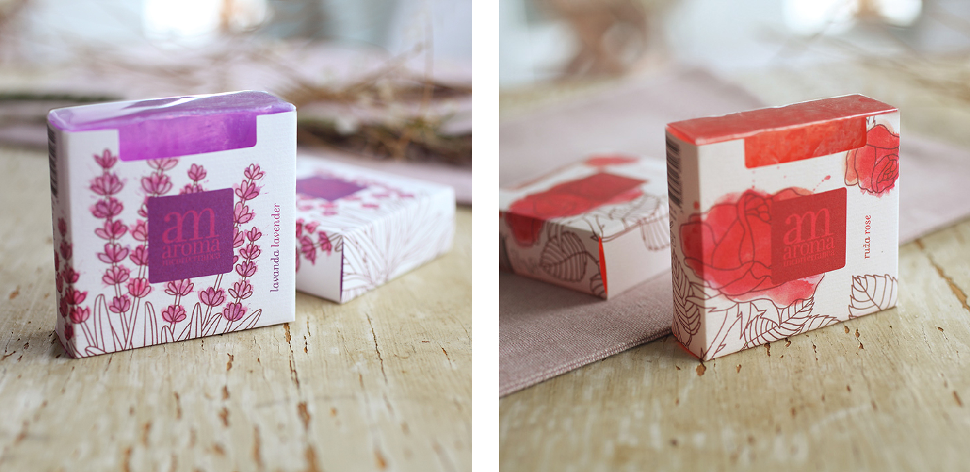
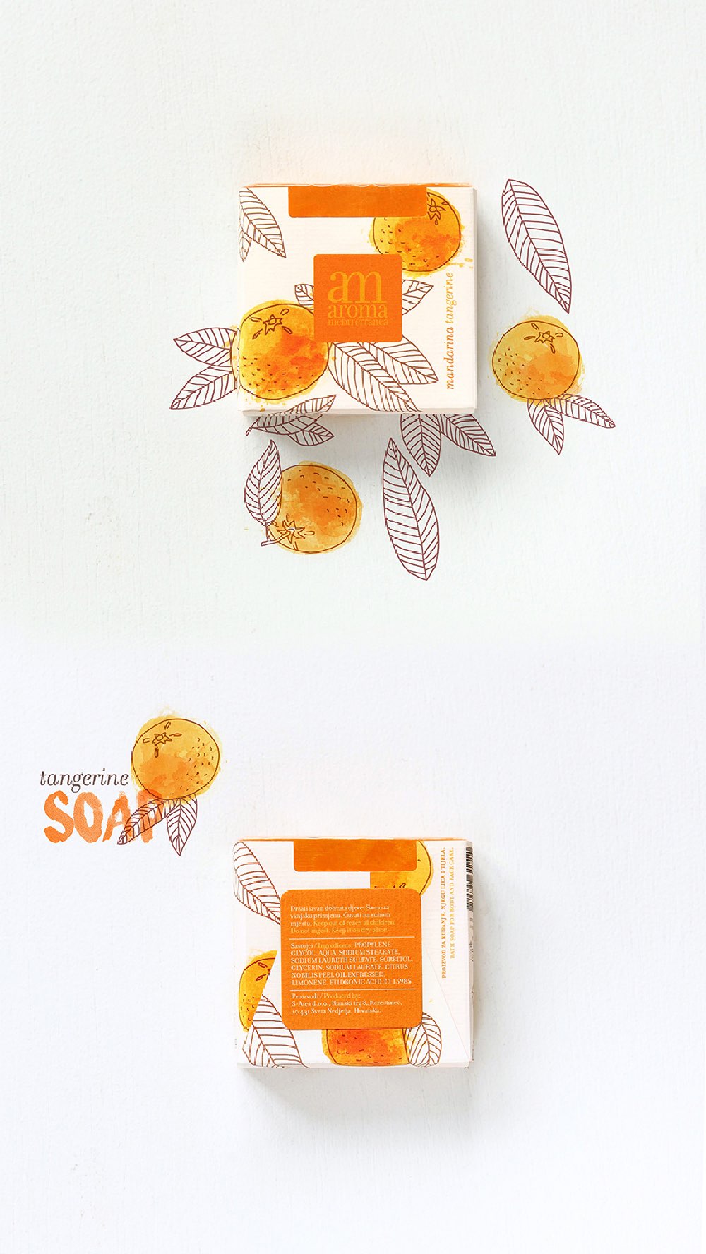
The first phase included redesigning the product as such. The shape of the soap was changed: its front part became a square – a more attractive form that also occupies a larger visible portion of the shelf. The “am” monogram is imprinted on the soap’s front part and the entire line of soaps was coded using more distinctive and positive Mediterranean colors. The element of the square was used as brand space and as the shape of the self-adhesive label on the back.
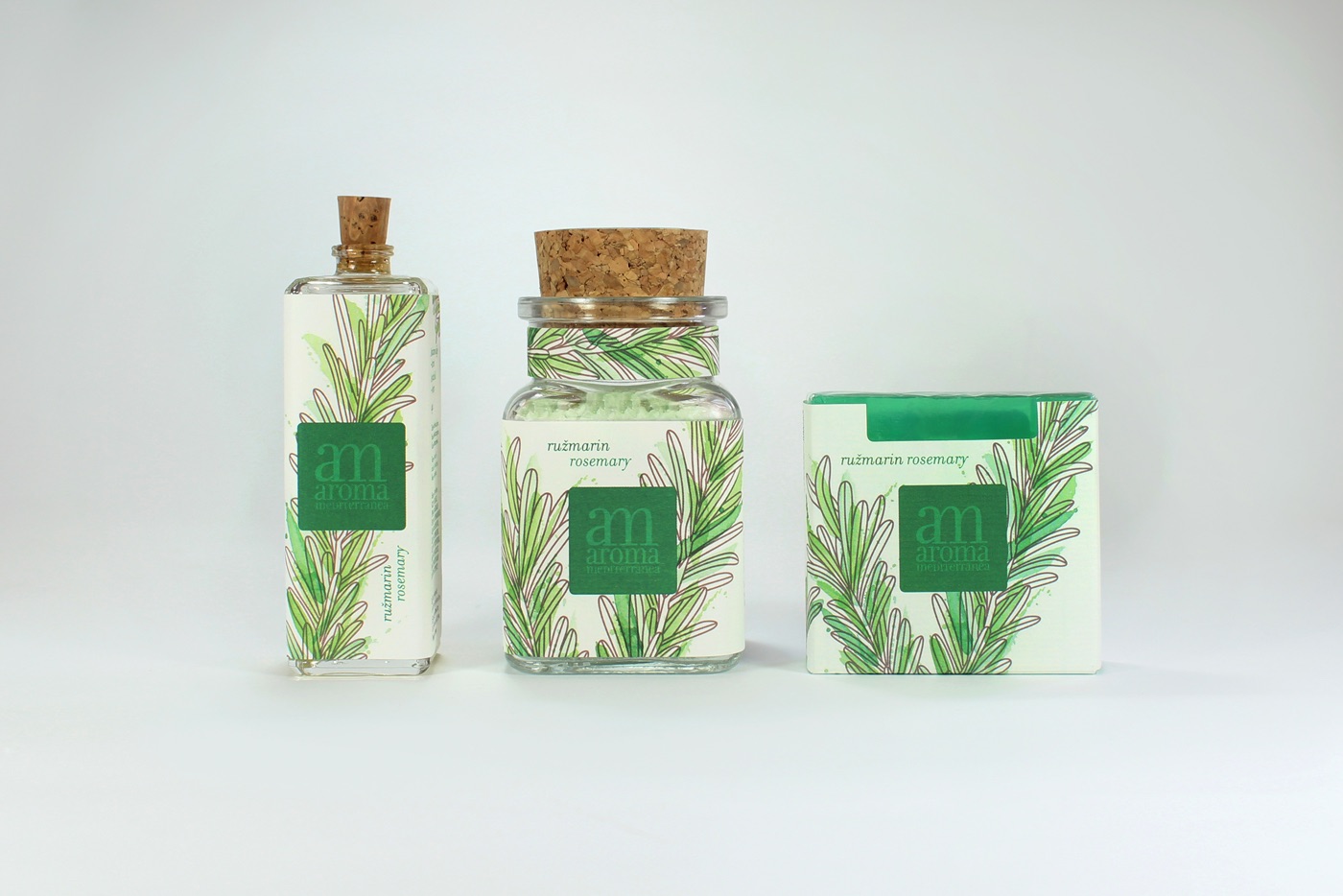
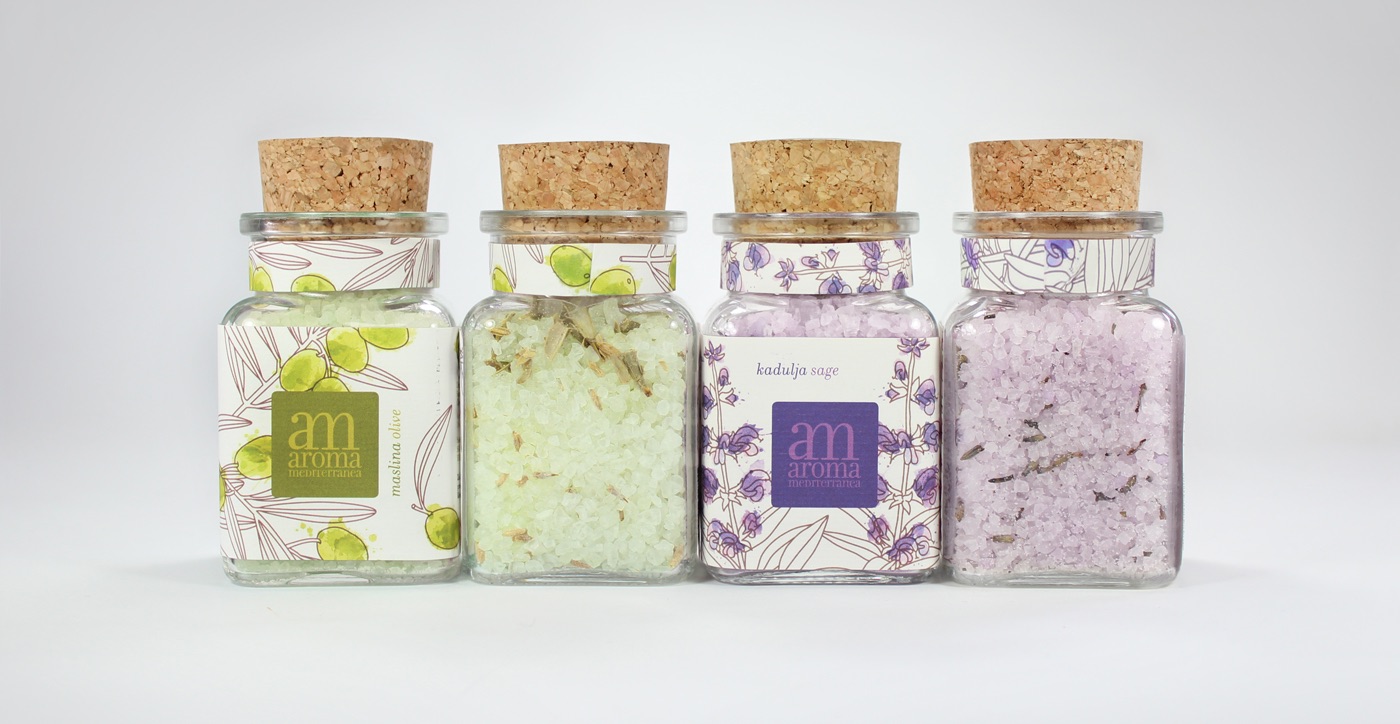
The shape of the vials was also changed: square-based vials with corks were selected. The main label was designed in such way as to wrap the vial on three sides, leaving the fourth side free in order to enable the visibility of the product’s color and structure. The dynamic arrangement of the products on the shelves creates a rhythm that illustrates the color and structure of the products.
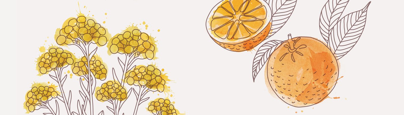
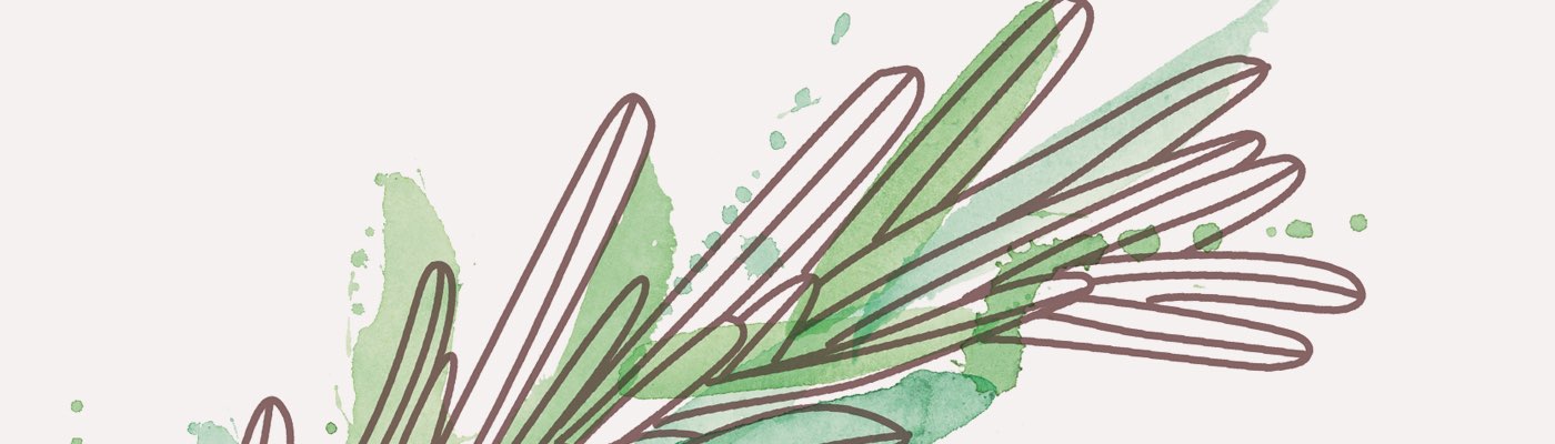
As this line of products is permeated with the rich aromas (fragrances) of the Mediterranean plants and fruits, the whole line is accompanied by attractive illustrations that convey the “spirit” of the Mediterranean. The use of attractive Mediterranean colors and combining of drawings and water-color paintings convey the feel of nature (drawings of plants and fruits) and water, hydration, relaxation, swimming (water-color paintings).
The color and structure of the product are visible through the opening on the top that also allows the passage of light through the structure of the soap (natural light or artificial light on backlit shelves), thus further highlighting the color and structure of the natural soap.
Client
- UJE d.o.o.
Creative team
- Izvorka Jurić (creative and art direction, design, illustration), Stela Kovačić (illustration, photography), Maja Danica Pečanić (photography)


Awards and honors
_
part of exhibition ZGRAF,
2017, CRO
_
featured project on Behance – Graphic design,
2016, International
_
published on Packaging of the World,
2015, International
_
published on The Dieline,
2015, International
_
published on ThinkDo3,
2015, International
_
published on Vizkultura,
2015, CRO