
BITE ART
verbalna komunikacija / identitet / brending / ambalaža / mrežne stranice
BITE ART are unique art-cookies, pepper biscuits, created by an artist Ana Šerić as a part of her “Edible art” project and aimed to promote Croatia in a single but impressive product.
They are traditional cookies taken to a new level – enriched with reproductions of Croatian artworks and transformed into an interactive souvenir that affects the senses and touches the heart.
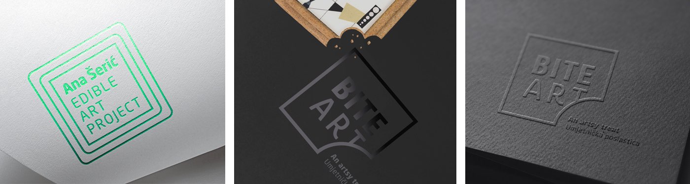
The brand and the edible art project logo is in the form of the pepper biscuits, which in graphic terms looks like a frame, and with the intervention in the form of the “bite”, literally conveys the name of the product – bite art. The brand idea was transferred to the packaging through the photograph of the pepper biscuit with a bitten off part of the biscuit and the artwork. The graphic shape of the project logo was also used as a frame for the artworks that are presented.
The product is also distinguished by top-notch production, where exclusivity is achieved by the use of glossy black foil on a mat black base (black on black) and a special color scale for the presentation of an individual artist – in the harmony with the aesthetics and the color of the artwork itself.
The sides of the packaging are designed as a side of the books since this product is really more about content than the cover itself or you can say it has a deeper meaning than the first look reveals. Thus, from one side of the packaging you can see the name of the author, the brand and the name of the project – as on the side of the book, and from the other side the characteristic detail of the artwork – the glance of the content.
The packaging of the product consists of the main sleeve, a protective foam insert, a certificate that affirms the authenticity of the work, and a solid base with a four paper biscuits collection. The solid product base (box), after consummation, transformed into a stand-alone frame with the reproduction of four artworks by the author’s collection. The frame functions as an attractive part of someone’s interior, travel souvenir or a lovely gift, giving this product added value. There is also a package for one paper biscuits in which the base functions as a frame with magnet surface on the back.
The BITE ART project will also serve as a platform for information on the Croatian artists involved in the project and for the promotion of the Croatian art as a whole.
Naručitelj
- Bite Art d.o.o.
Kreativni tim
- Izvorka Jurić (kreativna i art direkcija, dizajn), Jelena Gvozdanović (slogan), Igor Poturić (verbalna komunikacija), Stela Kovačić (dizajn, product fotografija), Marija Gašparović (portretna fotografija)


The brand and the edible art project logo is in the form of the pepper biscuit, which in graphic terms looks like a frame, and with the intervention in the form of the "bite", literally conveys the name of the product - bite art. The brand idea was transferred to the packaging through the photograph of the pepper biscuit with a bitten off part of the biscuit and the artwork. The graphic shape of the project logo was also used as a frame for the artworks that are presented.


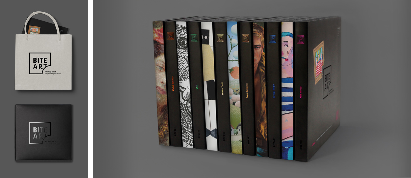

The packaging of the product consists of the main sleeve, a protective foam insert, a certificate affirming the work’s authenticity, and a solid base with a collection of four pepper biscuits. After consummation, the solid product base (box) transforms into a stand-alone frame with reproductions of four artworks by the author’s collection. The frame functions as an attractive part of an interior, a travel souvenir or a lovely gift, giving this product an added value. There is also a one-pepper biscuit package in which the base functions as a frame with the magnet surface on the back.
.


OKO is a fine artist that often combine different urban and street techniques. Although she is an accomplished draftswoman – just take a look at the virtuoso style of her surreal portraits - she indulges in installations and performances as well. Mysterious and self-effacing, OKO is always bound to surprise our senses.


Hrvoje Majer is a painter of the quietest things, like portraits of mysterious young men full of untold stories, meditating in the midst of the solemn sanctuary called Nature. On a stage bursting with bright neon green they live their silent lives in a world skillfully created by one of the most sensitive Croatian young artists of today.


Marko Tadić patiently creates his own private worlds, each with its original narrative told in a form of strict, almost monochromatic collages or articulate drawings made on old maps, postcards and photographs. Reduced to an archetypal level, his works elude simple and straightforward explanations… like dreams usually do.

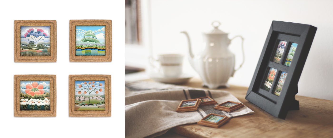
Ivan Rabuzin is everything but – naïve; his landscapes, exploding like fireworks yet consisting of very subtle shades of colors, always manage to surprise us with endless varieties of one and the same motif. Only a true master – and this is why the Japanese adore him – can create works so deceivingly simple and yet so complex at the same time!


Ana Kolega invites you on a journey to Dalmatia of the past: a colorful flashback packed with jovial ships, sailors in their striped shirts, patient brides and a galore of goodbye kisses. Her painted stories are like old sentimental movies - nothing strange for such a die-hard romantic and passionate tango dancer that is Ana.

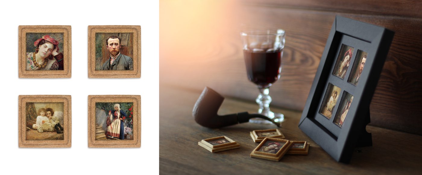
Vlaho Bukovac – a glance on his canvas – and we’re transported to another place, another time: we can hear children’s voices and silk rustling, we can sense an ancient perfume mixed with fragrances of ripe fruit and wild roses, and we almost squint from the strong sunlight of a bright summer day… that’s why many consider him the greatest Croatian painter ever.


Nagrade i priznanja
_
dio Izložbe hrvatskog dizajna 17/18
Hrvatsko dizajnersko društvo, 2018., HR
_
Nagrada CroPak 2018 za dizajn
2018., HR
_
dio izložbe dizajna Tjedan Dizajna Zagreb,
2017., HR