
Ericsson Nikola Tesla “Young Talented Professional”
annual report
Ericsson Nikola Tesla is a leader in information-communication technologies and has more than 55 years of experience. In the past 10 years the company managed to change the scope of its activity, becoming a unique example of a Croatian company that has successfully “reinvented” itself. In 2007, the company decided to become the first company in the country with a complete annual report. Our task was to design the company’s annual report which was to present the previous year’s business results (including their general, social and financial aspects) The condition was to adhere to the preset format and size of the publication (the number of pages and maximum thickness).
The annual report was realized as a typographical solution entitled “Young Talented Professional”, emphasizing the creativity based on knowledge and experience as the company’s unique comparative advantage. Set in the foreground, the designed messages creatively and directly communicate the basic values – the mission, vision, goals and accomplishments – that the company wants to share with others.
At first encounter with the report, its cover paper (Gmund Alezan Wild Cameleon) and additional print of a transparent orange-scented varnish convey the company’s fresh approach to business, but also to people and society in general.
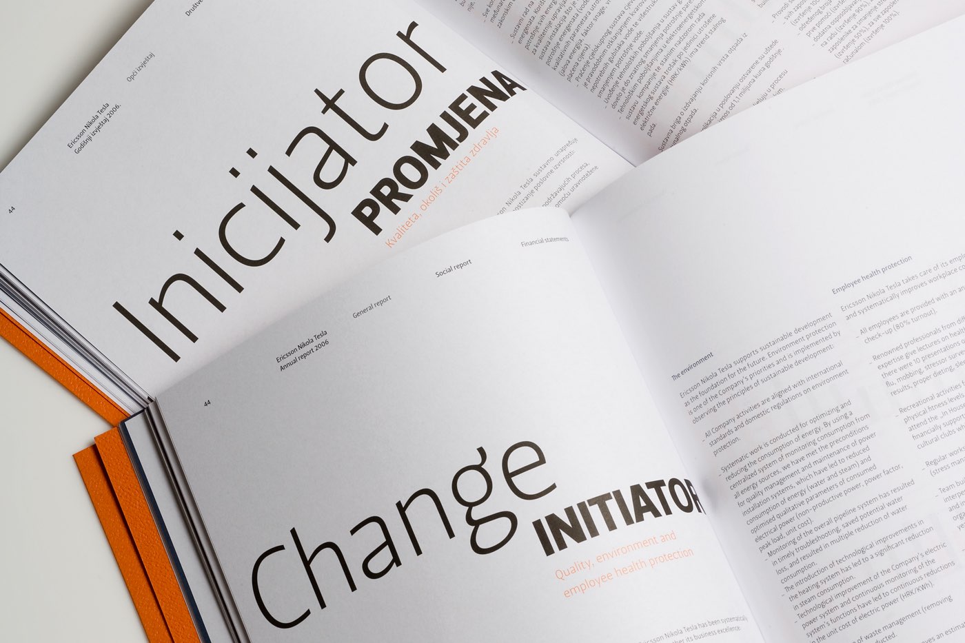
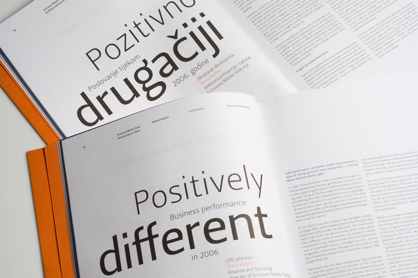
The grid system enables different treatments of the information contained, because there are three different sections integrated in the publication. The entire publication was realized without illustrations or photographs, using just typography (Leitura Sans, DSType) and only three colors – in addition to the corporate blue and black, orange was also introduced as the basic color for highlighting the layout.
Client
- Ericsson Nikola Tesla d.d.
- _
- designed for Tridvajedan
Creative team
- Izvorka Jurić (creative and art director), Jelena Gvozdanović (creative director, copywriter), Tin Kadoić (designer)

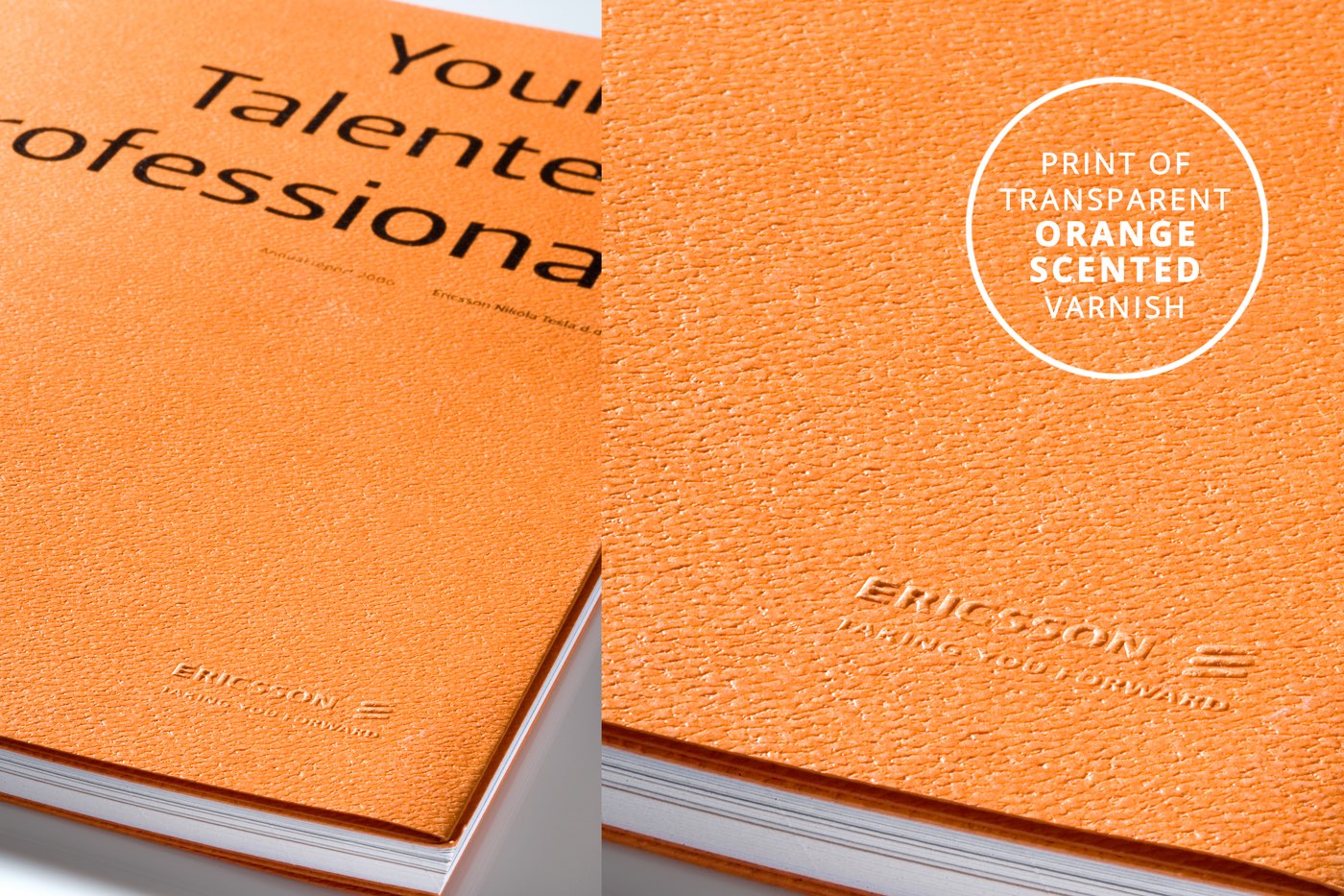
The annual report entitled “Young Talented Professional”, emphasizing the creativity based on knowledge and experience as the company’s unique comparative advantage. At first encounter with the report, its cover paper (Gmund Alezan Wild Cameleon) and additional print of a transparent orange-scented varnish convey the company’s fresh approach to business, but also to people and society in general.


Set in the foreground, the designed messages creatively and directly communicate the basic values – the mission, vision, goals and accomplishments – that the company wants to share with others. The entire publication was realized without illustrations or photographs, using typography only (Leitura Sans, DSType).


Awards and honors
_
part of “Exhibition of Croatian Design 07/08″,
CDS – Croatian Designers Society, 2008, CRO
_
Red Dot for High Design Quality,
Red Dot Design Award: Communication Design, 2008, D
_
HOW International Design Award,
HOW Magazine, 2008, US
_
published in Novum – world of graphic design,
New Media Magazine Verlag GmbH, 02 / 2008, D
_
in selection “100% European Graphic Design Portfolio”,
2008, PRC